- Airtable Community
- Discussions
- Ask A Question
- Other questions
- Re: Wrap kanban/gallery card text?
- Subscribe to RSS Feed
- Mark Topic as New
- Mark Topic as Read
- Float this Topic for Current User
- Bookmark
- Subscribe
- Mute
- Printer Friendly Page
Re: Wrap kanban/gallery card text?
- Mark as New
- Bookmark
- Subscribe
- Subscribe to RSS Feed
- Permalink
- Report Inappropriate Content
Jun 11, 2021 06:00 AM
I’m going to presume the answer is “no”, but is there really no way to wrap the text (esp title text) of a card when presented in kanban or gallery view?
Has anyone found the CSS rules that can be changed in Developer Tools, perhaps?
- Mark as New
- Bookmark
- Subscribe
- Subscribe to RSS Feed
- Permalink
- Report Inappropriate Content
Jun 14, 2021 01:43 AM
The relevant CSS class is .truncate, which is applied to card title links…
.truncate {
    max-width: 100%;
    overflow: hidden;
    overflow-x: hidden;
    overflow-y: hidden;
    text-overflow: ellipsis;
    white-space: nowrap;
}
If white-space were disabled or set to normal, truncation would be disabled and card titles would wrap.
Although they would appear a little untidily due to lack of vertical padding.
- Mark as New
- Bookmark
- Subscribe
- Subscribe to RSS Feed
- Permalink
- Report Inappropriate Content
Dec 08, 2022 09:52 AM
Hi Airtable team, I hope you are aware that the Kanban view is basically unusable without better handling of the card title. I think there is a 23 character cut off. That's is not a good solution. Please look at any other tool on the market that uses cards. Wrap the text, shrink the font and add more character count, etc. Anything. PLEASE!
- Mark as New
- Bookmark
- Subscribe
- Subscribe to RSS Feed
- Permalink
- Report Inappropriate Content
Jan 27, 2023 07:21 AM
Agreed. I also currently have the impression the Kanban board only "looks" like a kanban board, but isn't actually functional as one in any kind of task/project management. Mainly due to the 23 character cutoff. It gives the impression that it's designed more as a tool to categorize items or people with short-ish names, for which I guess this UX would work. The short titles really break the functionality, causing me to use table view, Notion, or Trello for task tracking.
- Mark as New
- Bookmark
- Subscribe
- Subscribe to RSS Feed
- Permalink
- Report Inappropriate Content
Dec 01, 2023 08:39 AM
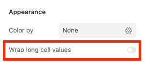
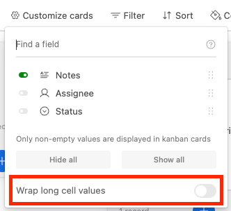
Hey everyone, we've now rolled out the ability to wrap these text values in Kanban Interfaces and views. See the images below to get started. I don't have an update on Gallery support at this time, but please do keep letting us know how important these features are to your workflows.
Enabling text wrapping in Kanban in an interface:
Enabling text wrapping in a Kanban View:
- Mark as New
- Bookmark
- Subscribe
- Subscribe to RSS Feed
- Permalink
- Report Inappropriate Content
Feb 24, 2024 09:47 PM
Totally agree. I’m new to Airtable, and think this might be a deal breaker for me as it completely inhibits the use of it being a take manager at the most basic (mobile) level.
- Mark as New
- Bookmark
- Subscribe
- Subscribe to RSS Feed
- Permalink
- Report Inappropriate Content
Feb 24, 2024 09:50 PM
Totally agree with this. I’m maybe having to leave Airtable because of this. Which would be infuriating having fallen in love with the general database functionality and spent a week moving all my data over.
- Mark as New
- Bookmark
- Subscribe
- Subscribe to RSS Feed
- Permalink
- Report Inappropriate Content
Feb 24, 2024 10:06 PM
Hi David, thanks for this but I notice that the wrapping setting isn’t available on the iOS mobile app?? This seems bizarre to me as a mobile interface is arguably where it’s needed most. I’m new here and love so much of what I’m discovering with Airtable but these basis omissions are so bizarre to (also no dark mode, no snap to column horizontal scrolling in mobile OS app kanban view etc…) and so many more UI things that in 2024 should by now just be default, surely?
- Mark as New
- Bookmark
- Subscribe
- Subscribe to RSS Feed
- Permalink
- Report Inappropriate Content
Aug 16, 2024 10:28 PM
Gallery support is needed ASAP. Gallery views with cut off text look awful. I'm currently having to search for an alternative product for our calendar because of this.
- Mark as New
- Bookmark
- Subscribe
- Subscribe to RSS Feed
- Permalink
- Report Inappropriate Content
Nov 06, 2024 02:51 PM - edited Nov 06, 2024 03:20 PM
Hi David, wrap text support in gallery view is needed to support our workflows as well. We are looking for this in both our single line and long text fields. Please let me know when this is available, or if there is a script to make this happen.


