This Product Ideas board is currently undergoing updates, but please continue to submit your ideas.
- Airtable Community
- Product Ideas
- Better mobile embed styling options and row layout
- Subscribe to RSS Feed
- Mark as New
- Mark as Read
- Bookmark
- Subscribe
- Printer Friendly Page
- Report Inappropriate Content
Better mobile embed styling options and row layout
- Subscribe to RSS Feed
- Mark as New
- Mark as Read
- Bookmark
- Subscribe
- Printer Friendly Page
- Report Inappropriate Content
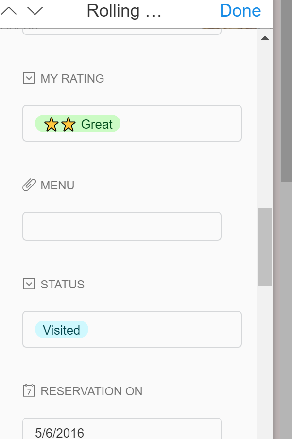
I’d like to suggest some more options for styling the mobile embed views of Airtable:
-
Ability to choose which columns are displayed in the mobile view
-
Ability to highlight (via card background color) specific cards in the table
-
Show sort and filter button
-
Show all fields by default on each card (useful for tables with a small number of columns)
-
Drop all the box formatting around cells - why is it even necessary on mobille?
The way mobile is displayed on airtable are the moment makes comparing rows in the table quite difficult. I think this needs to be improved. The table on this page may be a way to display tables on mobile - switching from horizontal view to vertical view. http://www.theverge.com/circuitbreaker/2016/10/4/13138204/google-pixel-phone-vs-iphone-7-galaxy-note...
- New Ideas 833
- Already in product 11
- Considering 0
- In development 0
- Not on the roadmap 2
- Launched 27

