Dean_Toland

6 - Interface Innovator
Comment Post Options
- Subscribe to RSS Feed
- Mark as New
- Mark as Read
- Bookmark
- Subscribe
- Printer Friendly Page
- Report Inappropriate Content
Jul 29, 2016
06:44 AM
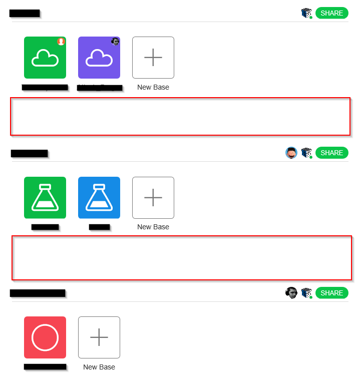
Right now there is a lot of blank space on the main page where you view your teams and bases. Since it’s entirely vertical there is a ton of dead space on the left and right, but almost as much between each team. Right now it looks like this (red zones are just dead space):
I would love to see this decreased so more is visible. I have half a dozen teams and even on a 27" monitor I can only see 3 at a time. Decreasing this space would be great, but even better would be allowing two teams side by side (like a grid) so the dead space is utilized and you can see more of your teams at once. Below would be much easier to scroll through:
Just a suggestion. :slightly_smiling_face:


