Jonathan_Schofi

6 - Interface Innovator
Comment Post Options
- Subscribe to RSS Feed
- Mark as New
- Mark as Read
- Bookmark
- Subscribe
- Printer Friendly Page
- Report Inappropriate Content
Aug 06, 2018
05:14 AM
This is kind of related to Better UI/UX for activity feed but more specific.
I’m new to Airtable and a huge part of its appeal is a single place to manage data and content, and to discuss it.
But the width given to an expanded record’s Activity pane is insufficient to make discussion easy – to write or to read – which means discussions are too likely to end up some place else such as Slack or Basecamp.
My experience to date suggests that, on desktop/laptop:
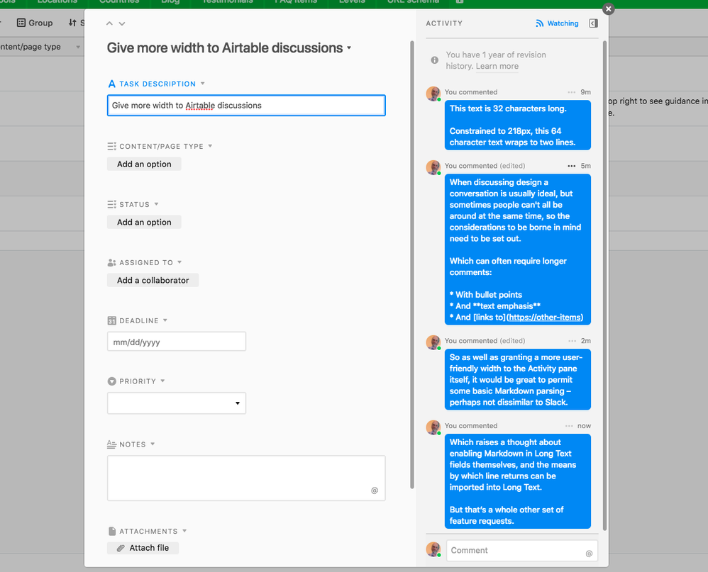
- The modal overlay for an expanded record has a fixed width of 838px given to it
- The Activity sidebar is given 308px of that
- Which leaves just 218px available for text content in a Comment.
That’s enough for only about 30 characters per line of Comment text, and that’s a pain.
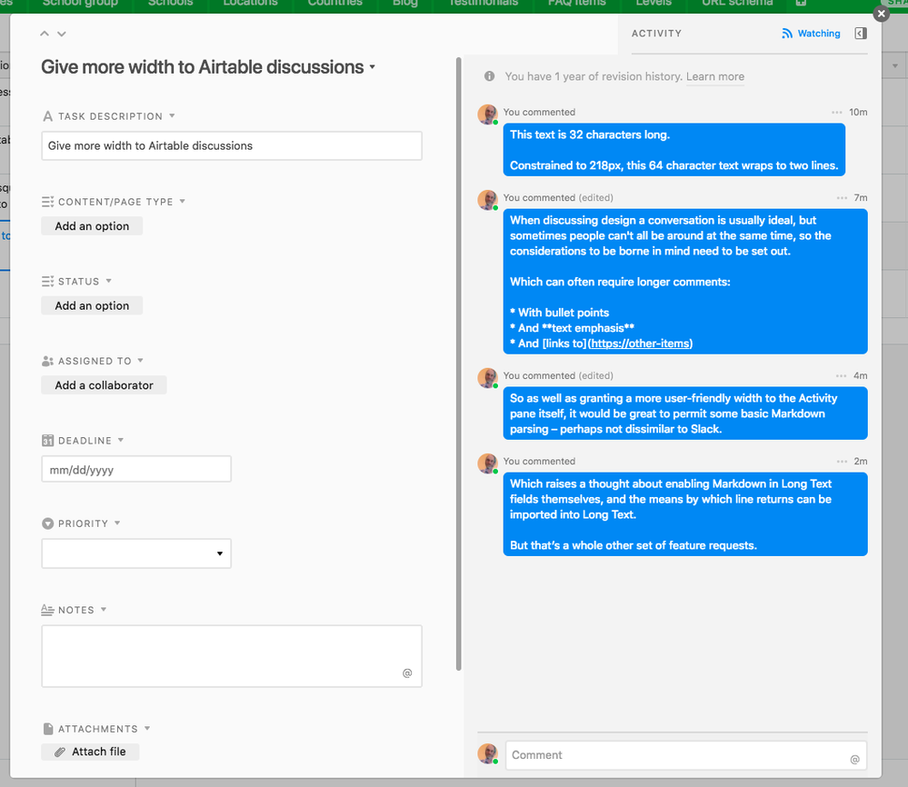
Please find a way to grant more width to the Activity pane when there is sufficient viewport width available. It ought to be possible for it to allow an optimal line length of around 65 characters.
4 Comments


