- Subscribe to RSS Feed
- Mark as New
- Mark as Read
- Bookmark
- Subscribe
- Printer Friendly Page
- Report Inappropriate Content
What is the proposed idea/solution?
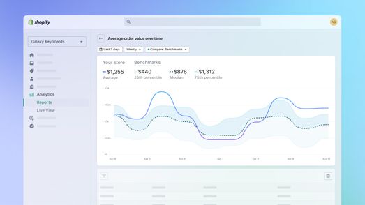
For date or time-dependent charts such as n over time (for example, sales over time), it's useful to have an option to compare the chart for a specific range. Similar to how Shopify's analytics chart works:
Either Airtable has a toggle option to show/hide a comparison preset, or interface users can customize the comparison range on their own.
For example:
- there's a line chart for tracking website sessions (y-axis, sum) over time (x-axis, month)
- the data records from January 2022 to October 2023
At the moment, the Airtable interface can only show a flat line from January 2022 to October 2023, but it would be simpler to only show January to December 2023 (the line ends in October since there's no data yet for November and December 2023) and toggle a comparison overlay on top of the chart by showing data from January to December 2022.
How does this solve the user problems?
At the moment, the best way to do this is to have multiple aligned charts and compare them side-by-side. However, this comparison chart overlay allows users to quickly gauge metrics over time using the same chart. Is the number weaker during the same month but different year? You'll easily see it on the hills and valleys of the chart.
Much better if we could customize the line/thickness/opacity/color of the overlay chart as well as the ability to set a benchmark.
How was this validated?
Taking advantage of data bucketing by weeks, months, years, etc.
Who is the target audience?
Analysts. Interface users. People who like charts.


