Andrew_Enright

9 - Sun
Comment Post Options
- Subscribe to RSS Feed
- Mark as New
- Mark as Read
- Bookmark
- Subscribe
- Printer Friendly Page
- Report Inappropriate Content
Jun 10, 2018
08:47 AM
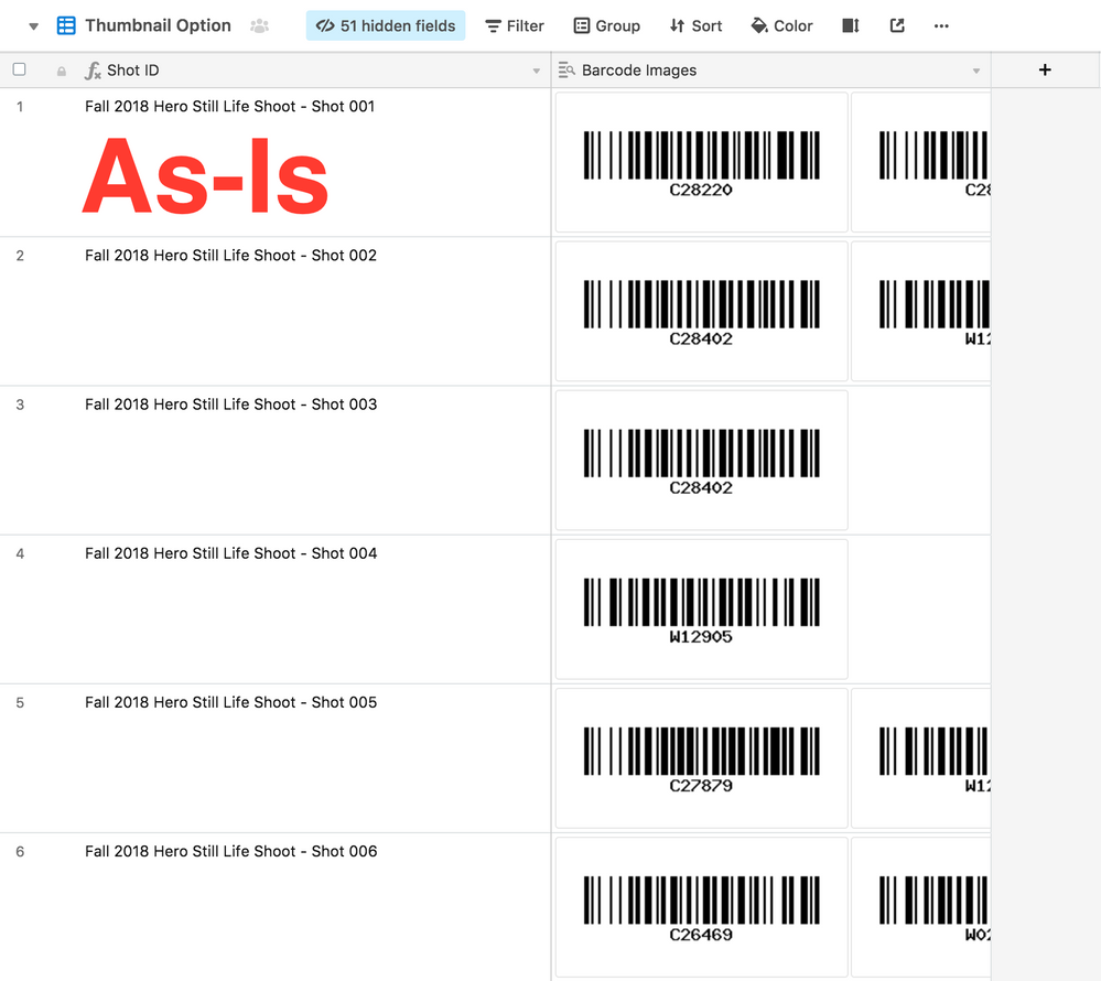
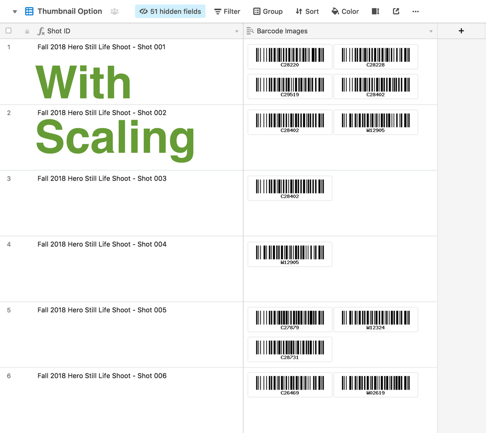
While we love the Row Height option in some of our views, we struggle with how images within attachment fields are previewed. Currently, each image within an attachment field fills the full height of the row/record. This is a sub-optimal use of screen real estate. Instead, we suggest a thumbnail scale option within the field settings. This could be a slider, or simply a choice between 1-up, 2-up and 3-up thumbnail grids.
Here’s a before-and-after of what we’re thinking:
And if implementing such scaling, why not add it to the Gallery View? While full-frame thumbnails LOOK great, a small grid of thumbnails would likely be more useful in a lot of use cases; particularly as screen resolutions increase.
See more ideas labeled with:
4 Comments


