Isaacr

5 - Automation Enthusiast
Comment Post Options
- Subscribe to RSS Feed
- Mark as New
- Mark as Read
- Bookmark
- Subscribe
- Printer Friendly Page
- Report Inappropriate Content
Sep 02, 2023
09:36 AM
Status:
New Ideas
What is the proposed idea/solution?
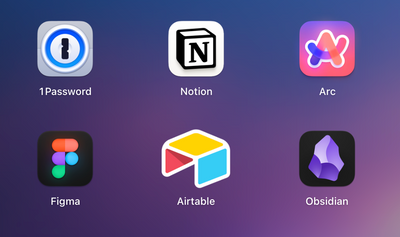
Change the macOS desktop app icon to be a rounded square. The current icon looks out of place among other macOS app icons.
How does is solve the user problems?
It improves the appearance of the Airtable icon in users' docks and launchpad.
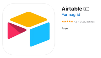
The icon could be replaced with the iOS app icon, which is a rounded square.
How was this validated?
All macOS apps are supposed to have rounded square icons.
Who is the target audience?
All users of the Airtable macOS desktop app.
See more ideas labeled with:
2 Comments


