- Mark as New
- Bookmark
- Subscribe
- Subscribe to RSS Feed
- Permalink
- Report Inappropriate Content
Aug 12, 2020 03:39 AM
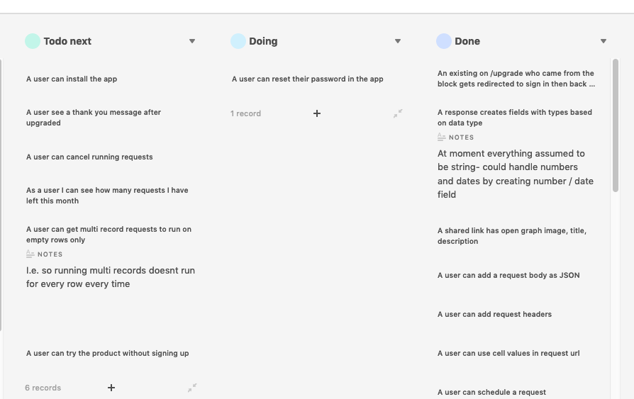
Would love to share with the community here a UserStyle that modifies the display of Airtable’s Kanban view to make better use of available space and simplify the cards UI. It also applies thin scrollbars all over airtable.com (this block may be removed) and modifies a collaborator field with the title “Action of”, if it exists.
Don’t get me wrong, the Airtable team is doing a great job, but the chrome is a bit on the heavy side with all those borders. Several design choices are “embedded” within the implementation, therefore impossible to modify.
See here for the UserStyle and instructions on how to use it: https://github.com/Arty2/userstyles#airtablecom-neat-kanban

- Mark as New
- Bookmark
- Subscribe
- Subscribe to RSS Feed
- Permalink
- Report Inappropriate Content
Sep 23, 2020 02:28 AM
@Heracles this is so useful. I was about to give up on Kanban before I found it.
One slight issue - I installed in via Stylus in Firefox and it looks a little different to the preview screenshot - all the stacks and background blend into one grey. Still usable and an improvement as I can see card names now, but if there’s any chance you can fix this it’d be even better!
- Mark as New
- Bookmark
- Subscribe
- Subscribe to RSS Feed
- Permalink
- Report Inappropriate Content
Sep 23, 2020 02:56 AM
Hi @Andy_Cloke, glad that there’s more people that find it useful!
That’s interesting, I am also on Firefox and its still working. It’s likely we are on a different A-B testing group for new features / design and that affects it somehow.
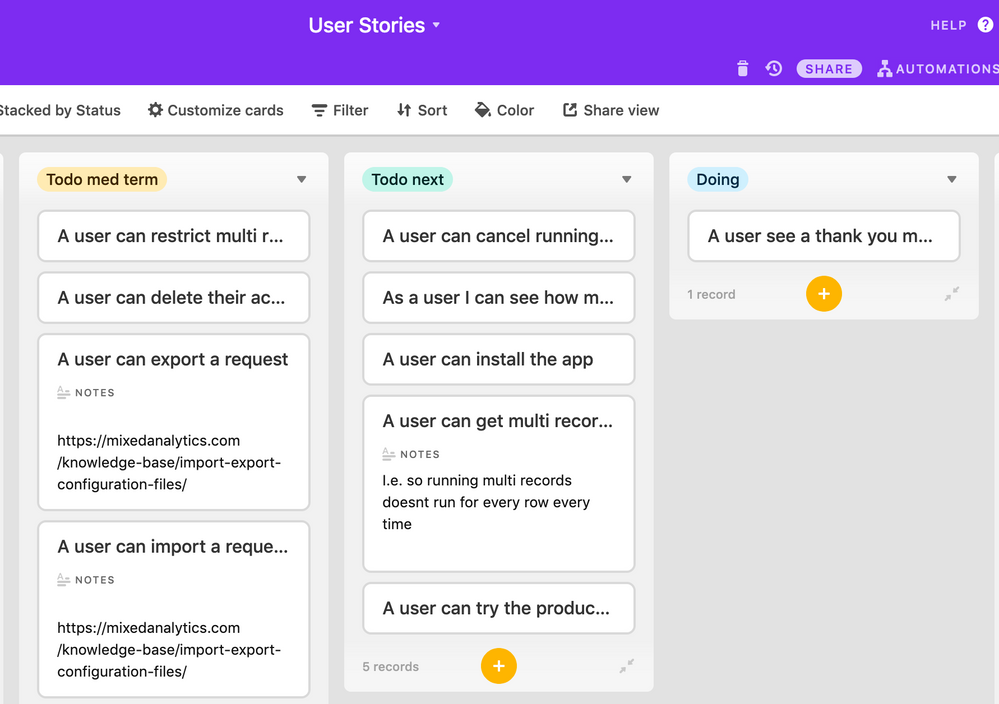
I will look into adding a different border from what Airtable already displays. Could you share a screenshot of how it appears without the userstyle?
- Mark as New
- Bookmark
- Subscribe
- Subscribe to RSS Feed
- Permalink
- Report Inappropriate Content
Sep 23, 2020 07:24 AM
Sure thing! Here’s without the userstyle:


