- Subscribe to RSS Feed
- Mark as New
- Mark as Read
- Bookmark
- Subscribe
- Printer Friendly Page
- Report Inappropriate Content
Hi all -
I hope the week is off to a great start.
I’m excited to share that we have some exciting additions coming to Interface Designer this week :tada:
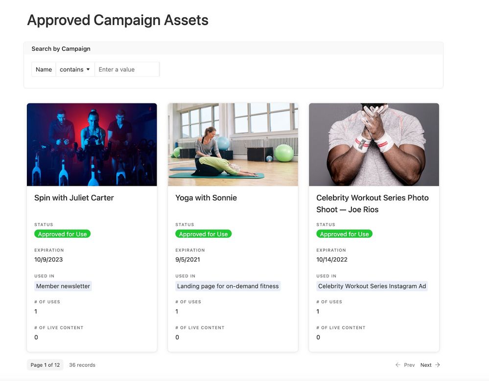
Gallery Element in interfaces unlocks the ability for collaborators to view multiple resources, images, or other key information at once. The gallery element visually represents thumbnails of the information from a base in an easy to review display. The use cases are endless, but some top examples include:
- List of resources (for example presentations or PDFs)
- Team directory (can add a filter element to filter by team)
- Digital Asset Manager
- Asset overview for launch
Grouping in Record View layout is powerful for triaging through records quickly, but with grouping, we’ve made it even easier. This feature is particularly useful for creators managing large data sets and need more filtering options so that their team can easily navigate to the most relevant information. You can now group and collapse sets of data, color code them, and have up to 3 layers of grouping.
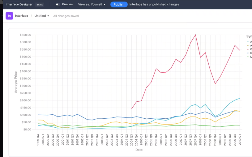
Chart enhancements allow for comparative analysis. With the enhancements to the chart element, creators will be able to chart multiple segments on a single graph for comparison and further analysis. This unlocks use cases like comparing budget spend by month year to year, mapping projected revenue versus actual, or reporting on NPS scores overtime grouped by customer tier.
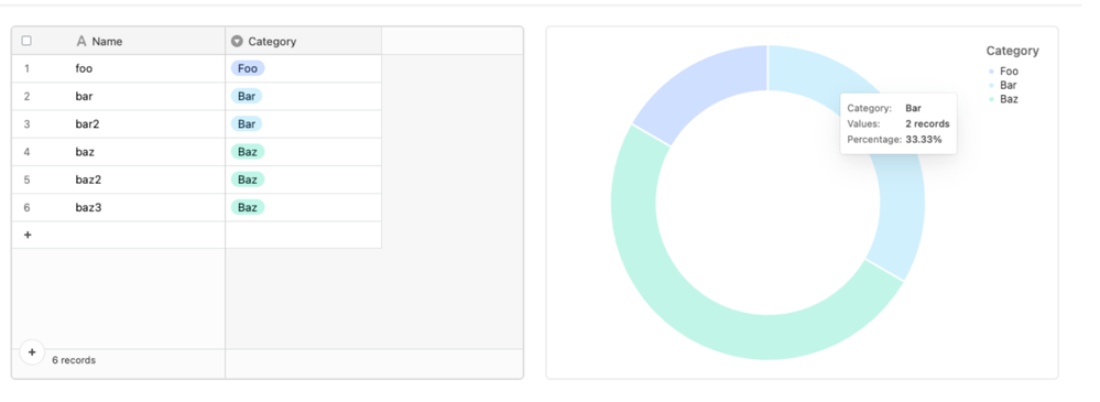
With these updates, creators will now be able to understand their pie and donut charts at a glance with percentage values. With this improvement pie and donut charts will now show the % of each segment in addition to the absolute amount.
You can use these new Interface Designer features in Airtable here.
Additional resources:
Blog series: Interface Elementals
Support article: Gallery element
Support article: Multi-series line chart
Support article: Grouping in a record review layout
Let us know how you’re planning to use these features below, we can’t wait to hear!
