Help

Improvements to expand and edit records

cancel
Showing results for 
Search instead for 
Did you mean: 
Jordan_Scott1
Airtable Alumni (Retired)

Hi all!

We are excited to share that as of today, we’ve made it easier for you - and your team - to expand and edit records in Airtable.

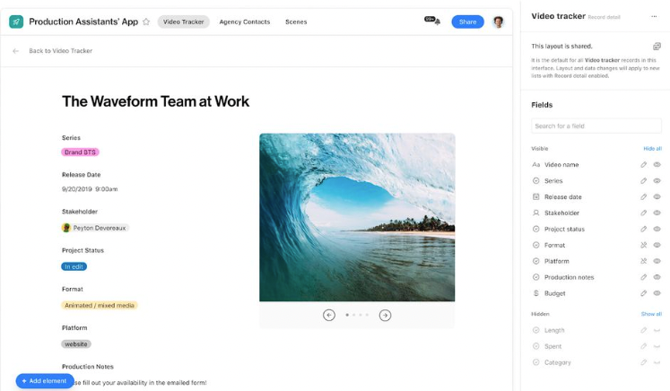
  • We’re making it easier to edit records while in the expanded view. We’ve increased the area around fields (including moving the field label to the left to save vertical space) in the expanded view for each record and made improvements to the activity pane.
  • We’ve also made it clear when a field is editable in expanded view so your collaborators can easily make edits.
  • We’ve added a persistent action bar so that common actions like changing between records, turning on comments, and the record title all stay in the same place, even as you scroll through the details.

You can expect these updates to be reflected in your bases in the next two days. We’d love to hear feedback from you about this change, so please leave your feedback below!

115 Comments
Admin_Promis_Ju
5 - Automation Enthusiast

Maybe Airtable see the expand record as a future front.
it would explain why we don’t see field type logo.

kuovonne
18 - Pluto
18 - Pluto

I would like to extend a welcome and thank you to all of the users who normally do not visit this forum, but came here anyway to express their feelings about this feature change.

@Dara_Brannan @Jeremy_Luebke @Jeremy_John_Thompson @Admin_Promis_Jure

It is no surprise that third party consultants like myself provide feedback here. I think it says something that the rest of you felt strongly enough about these changes to either dust off your community account or to create a new account to have your say.

So far the only Airtable employee to post in this thread is @Jordan_Scott1 who started this thread. I am quite sure that she has read and taken to heart each and every one of your posts, even if she is not at liberty to reply at the moment. I am sure she is doing her best to communicate your feedback to the people who actually make design decisions like this.

Paul_Warren1
6 - Interface Innovator

I just want to point out the lovely job @Jordan_Scott1 has done for Airtable. Before you came on no one would ever say

We felt totally disconnected. Thanks for being here @Jordan_Scott1 , even though you have to feel the brunt of our frustration.

I am glad that Airtable is seeking to improve the Expand and edit record experience. It is one of my least favorite parts about Airtable and cringe when I have to use it. Hopefully, we see a reversal of this particular change, but a continued effort to improve it!

ScottWorld
18 - Pluto
18 - Pluto

Great points. None of us are angry with @Jordan_Scott1, who is not responsible for any of these frustrating changes that she reports to us! :slightly_smiling_face:

On the contrary, @Jordan_Scott1 is one of the few Airtable employees (maybe the only?) who takes the time to post here and communicate with us! :slightly_smiling_face:

p.s. Jordan, hopefully you have enough “internal pull” at Airtable to get these new changes reversed ASAP! :winking_face:

SergioCodes
8 - Airtable Astronomer

Aaagh !!!

Why Airtable ?? Why??

I was writing 500 words complaining about this thing; I´m tired of complaining about bad decisions in terms of pricing, performance, etcetera.

So I will only say:

WE NEED FIELD TYPES

Look at these fields:

image

Both seem editable; I should click Customer Key and update it; guess what happens when I double click ???

image

GGGAASDSAND LSAD DAASDSAD ASD ADS N (me being frustrated with the keyboard )

So I´m kindly asking you to return the old expandable view, let´s pretend that the old is the new and everybody will celebrate :tada:

Thanks

ScottWorld
18 - Pluto
18 - Pluto

Haha, great idea! Bring back the old view, and all of Airtable’s customers will celebrate the “new & improved” detail view!! :stuck_out_tongue_winking_eye:

kuovonne
18 - Pluto
18 - Pluto

Instead of simply bringing back the old view, could we have the people who designed the new View Sidebar look at the feedback people are providing and come up with a new design that is better than both the current and the previous designs?

Rebecca_Elam
9 - Sun
9 - Sun

i know i said i wasnt gunna say anything else but I wanted to jump on the thank you @Jordan_Scott1 train. you’re amazing and we love you and I’m sorry you’re the one who always ends up getting yelled at because the people above ya wont face us. you are strong my friend I couldn’t do what you do.

Cara_Van_Meter
6 - Interface Innovator

Like Coke Classic! :rofl:

Julien_Mottet1
6 - Interface Innovator

The first reaction of casual users is : “it’s cool, it’s cleaner”.
Only hardcore users see the drawbacks of this new design.
This new design is going to please new users.

If you want to attract new end users… Good Move.
If you want to keep your community of makers… 😞 :frowning:

This is aligned with the new plan strategy.