Help

Introducing new ways to harness the power of AI, build apps, and connect data

cancel
Showing results for 
Search instead for 
Did you mean: 
Stephanie_Sosa
Airtable Alumni (Retired)

👋Hi all! I’m Stephanie, product marketer at Airtable and I'm so excited to introduce some powerful new features to help teams build AI-powered apps on top of shared data—all within a single, scalable platform.

Today, we’re bringing AI to Airtable, making Airtable the easiest and fastest way to deploy AI-powered applications across the enterprise. We're also releasing new features to empower teams to get up and running and build powerful apps quickly with a suite of pre-built applications for marketing and product teams. 


  • Apps by Airtable: Get set up and running faster than ever with out-of-the-box apps built for critical use cases. Available for Enterprise.
  • Verified data: Easily protect and manage your org’s most important data from one place, while making it accessible to those who need it most. Available for Enterprise.
  • Two-way sync: Automatically sync data and edits back and forth between workflows so your teams can easily collaborate on the most up-to-date information. Available for Enterprise.

We’re rolling these updates out over the next week; if you don’t see them reflected in your workspace, hold tight! 

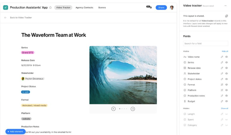
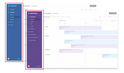
But something I’m super excited to announce is a new left navigation in Interface Designer. Now, we’re making it easier for you to quickly find and engage with the most important parts of their workflows. In addition to the updates we released back in March, Interface Designer makes it that much easier to build on Airtable. (And spoiler alert: we’re not done. Stay tuned for even more exciting updates to the app building experience)

Stephanie_Sosa_0-1683733750437.png

Left Navigation: New left navigation panel for easy navigation between interfaces & pages.

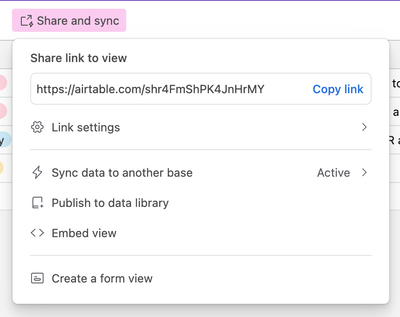
But that’s not all, you’ll also see that we cleaned up the share view menu so that your teams can discover and share important views and data across the org.


Stephanie_Sosa_1-1683733760055.png
Redesigned Share View Menu: Simplified sharing and syncing with a redesigned share view dialog.

These features will be a game changer for teams of all sizes—helping them build the apps they need on a scalable, secure platform. Learn more about these updates in our blog post!

We can’t wait to hear what you think, and see what you build, with these updates!
126 Comments
Bill_French
17 - Neptune
17 - Neptune

>>> ... the collapsable sidebar is now available!. we were listened hehe!

@Tristan-ARG Actually, you were ignored until it became apparent that they should have listened more carefully before making this devastating change. I get it - the weight is suddenly lifted, and the product has resumed its stellar UX. We are all compelled to applaud, but should we?

I'm happy for everyone who is now happy. But I feel awful that this great community of consultants and business users had to endure this completely avoidable event. I wonder if Airtable will learn from this or repeat it again soon.

Legacy UI behaviors cannot be underestimated because all historical success is predicated upon them.

The lesson is simple -- when making significant UI changes that impact UX -- include an opt-out option.

Instrument the opt-out option to gather analytics about customer preferences. User behavior analytics is the fastest and least expensive way to listen to 100% of your customer base.

Zach_Conrad
6 - Interface Innovator

I agree with @Bill_French here. What is so frustrating is we get a quick paragraph of "oh, we fixed it." I think we all need some recognition for what the last few weeks have been like. Accountability, and then how Airtable will proceed moving forward. I remember when editable share view links were clawed back; when that happened, there was a whole page long apology which explained how it happened and why that isn't a direction Airtable is headed in (I didn't agree, but they explained themselves). 

Why doesn't Airtable take a more active role in talking with customers here in the forum? The silence, still, is deafening. 

Tobias_LGKR
7 - App Architect
7 - App Architect

Dear Airtable,

as I don't really know where else to write my thoughts, this thread and its dominant theme seems like a good place. So here goes:

Some thoughts about our relationship

I have been meaning to write you for some time now. We are not dating anymore. You had me hooked rather quickly and for some time now we have been in a serious relationship. I entrust you with some of my greatest secrets and believe me, I don't do that with just anyone. And just because I am paying you for our realtionship, that doesn't mean I don't care about your side either. I don't take things for granted and I hope the same goes for you.

Just know, in here, in this community forum, I don't need your marketing persona. You have me! You don't have to excite me about things or sell them to me. Either I'm excited by what you do or I am not. And no, I don't need to be happy about everything all the time. And yes, surely a little romance keeps our relationship alive but on the overall I need straight-talk. Just tell me how it is and I promise to do the same. Please don't follow this utterly boring path of the Tim Cooks of this world who tell me everything is the greatest, fastest, most super-duper thing since whenever. I can decide that for myself. Just be yourself. Do what you do best. That's how I like you best.

Right now we are having a trust issue. You are making me feel like you don't really listen. Perhaps I am being unfair but that's how you come across. Perhaps you could work on that? A lot? I know there are many things to consider in your world. But if you could make me feel a little more like my small bucks are no less to you than the big bucks of others, I would really appreciate it.

I love the work you do. Now it's your turn.

Respectfully,

Tobias

TDY
6 - Interface Innovator

Bill French said:

"I'm happy for everyone who is now happy. But I feel awful that this great community of consultants and business users had to endure this completely avoidable event. I wonder if Airtable will learn from this or repeat it again soon."


Shannon said:

"There are a few more changes to help improve the building experience with preview and moving between data, automations, and interfaces coming soon."


THAT IS NOT REASSURING, BUT RATHER EXTREMELY CONCERNING.


Shannon, I'd strongly recommend you get out ahead of the next disaster by running these "Few More Changes Coming Soon" ahead of your client base here.

Please do not repeat this disastrous user relationship fiasco.

BillH
9 - Sun
9 - Sun

I would have to agree with @TDY here. 

Once Airtable moved into the "development platform" area with Interfaces they created a whole new level of responsibility.  It's no longer just how your modifications impact your direct partner clients, it's also how they impact their partner clients as well.  

I've spent a lot of time in my career finding workarounds with other people's applications, but that doesn't mean I can expect I can expect everyone using my applications to be able (or willing) to do the same thing.  When I need to change something it becomes my responsibility to let them know...

  • What I am changing
  • When I am changing it (with a reasonable amount of notice)
  • How they can see what is being changed (and if possible how they can try it for themselves)
  • How they can let me know if they have any issues or concerns

That's not an all inclusive list, but it's a start, and I don't think it's too much to ask Airtable to do something similar.  


Bill_French
17 - Neptune
17 - Neptune

>>> That's not an all inclusive list, but it's a start, and I don't think it's too much to ask Airtable to do something similar...

In this regard, the all-inclusive definition is fleeting and likely never attainable.

All that and more can be avoided using conditioned feature paths for things that affect usability. If the user wants to stay on a legacy behavior, they should be allowed to do so, perhaps by default. New, experimental, unproven, and innovative UX features should be made optional.

If you want to advance your product faster and with greater insight, users need to be heard through data collected without friction and without humans spending lots of time filling out forms. Whatever data you get from humans will be biased. Voting with toggle buttons is far more precise and gets you the data you need to know how a new idea is being received.

I'm not advocating a model that isn't already used by nearly every product team except Airtable. And we know they're capable - they did this a few times in the past with attachment URL deprecation for example.

mprokop
5 - Automation Enthusiast

@Shannon_Anahata Thank you for making the sidebar collapsible! 

Now if there were only a way to move the sidebar to the top of the page, and instead of icons, perhaps we could get text of the names of pages. It's a much, much faster way to navigate for those of us with only a handful of pages. 

Still not super happy with how this all went down, as you can probably guess.

Karlstens
11 - Venus
11 - Venus

Thanks @Shannon_Anahata  ,

I've provided some initial feedback via the new Feedback form found within the Interface Edit. I think the biggest requirement that's come from this Interface update and the initial feedback, is that we're needing a simple toggle that allows users to toggle the recent updates on or off, at a time that suits them.

It's a simple ask, and has already been introduced for the HomeScreen Improvement project, and I feel it's much more warranted in the case of Interface UI updates.

DataGuru
6 - Interface Innovator

Previously, I was able to specify the background color for each Interface Icon.  The colors provided an effective means of directing my clients to the most important interfaces in their workflow.  This was a great feature since I could help my clients to understand which Interfaces were transactional in nature, and which were fully for maintaining reference tables.  My preference is to make the application data-driven, so this was an important feature.

With the latest update, the ability to specify the Interface background color has been removed.  The color is defaults to the color assigned to the databases.  Why?  This undermines my ability to build effective applications for my clients.  Please reinstate this feature.

DataGuru
6 - Interface Innovator

I agree with many of the thoughts shared in the thread.  Prior to each software release there needs to a prioritization of enhancements and issue resolution, followed by a thorough impact access across all client segments ( e.g. Plans).  Most of all, communication with the customer bases for what changes are in the pipeline, and their expected release…. These are all areas where Airtable should be seeking improvement.