- Subscribe to RSS Feed
- Mark as New
- Mark as Read
- Bookmark
- Subscribe
- Printer Friendly Page
- Report Inappropriate Content
Hi there! I’m Rosalind – a product marketing manager at Airtable focused on helping teams build powerful, custom applications that make work more efficient. I’m eager to share that we have just launched support for pivot tables in interfaces!
Starting today, all users on a Teams plan or higher will have access to pivot tables directly in interfaces.
What is a pivot table?
A pivot table is a powerful data analysis tool for succinctly summarizing and analyzing large datasets. The format of a pivot table lets you rearrange and aggregate data dynamically, making it easier to identify patterns, trends, and insights.
Historically, the only way to use pivot tables in Airtable was via the Pivot table extension. With the launch of this new feature, you can easily add pivot tables directly to an interface page without relying on an extension.
How can you use a pivot table?
Aggregate and summarize your data. Pivot tables allow for the aggregation and summarization of large datasets into manageable blocks of information. You can use a pivot table to quickly condense vast amounts of data into meaningful summaries, such as totals, averages, counts, and percentages.
Explore your data from multiple perspectives. Pivot tables offer dynamic analysis capabilities, making it easy to slice and dice your data in different ways. With the ability to rearrange specific fields, you can quickly switch between different dimensions and hierarchies to uncover patterns, trends, and outliers.
Customize how your data is displayed. Pivot tables provide a high degree of customization and flexibility, allowing you to tailor your analysis to fit your team’s specific needs and preferences. From adjusting layouts and formats to applying filters and sorting, pivot tables give you full control over how your data is presented and analyzed – making it easier to derive actionable insights.
Where can you access pivot tables in Airtable?
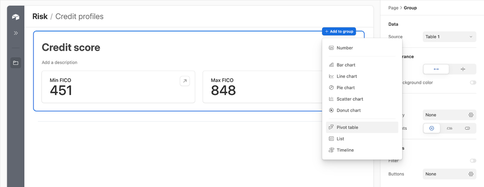
Initially, pivot tables will only be supported in dashboard layouts. To add a pivot table to a dashboard, open the “+ Add to group” menu and select “Pivot table”
For more information on selecting row and column groupings, splitting multiple values, determining what is displayed in your table, and accessing underlying records from a pivot table, you can read through the support article on the dashboard layout here.
We’re excited to see what you can do with pivot tables! As we continue to add new features to interfaces, we’ll be sure to keep you updated here and on our What’s New page.
You must be a registered user to add a comment. If you've already registered, sign in. Otherwise, register and sign in.


