Help

Question of the Week!

cancel
Showing results for 
Search instead for 
Did you mean: 
Laura_McCarthy
Airtable Alumni (Retired)
Hello Airtable Community!
 
Time for question of the week 🎉 Be sure to share your ideas in the thread below. We will be sending swag to 3 lucky individuals. This week we want to know what are your tips & tricks for creating great collaboration experiences and interfaces in Airtable? 
 
We look forward to reading through everyone's response. 
Airtable Community
7 Comments
Shannon_Bradley
7 - App Architect
7 - App Architect

I am still fairly new and have SO MUCH TO LEARN - but I seriously love this product and am constantly telling people about it. I found that starting my collaborators out by setting up a View that contains the basic information they need to see and telling them to treat it like a Spreadsheet eased them into system. Then I start getting them used to different Views, then finally how expanding the record gives them a great method of working with a record.

Slow and steady converts them 🙂 

Laura_McCarthy
Airtable Alumni (Retired)

@Shannon_Bradley Happy to hear your enjoying the platform! Diving into views and expanding records has helped me immensely. 

RonniEloff_VKDe
8 - Airtable Astronomer

Creating views that can them be shared and posted to the website for our volunteers to review and comment on in a way that makes it very visual. 

This gives me the flexibility to control the data in the Tables but at the same time get our volunteers involved in looking at the presentation of the data that helps them.  I plan on adding a form to the Webviews so we can capture more information back into the system.


Laura_McCarthy
Airtable Alumni (Retired)

Fantastic idea to get your volunteers exposed to the tool. I am a visual learner so I would find this very helpful.

ramonscardua
5 - Automation Enthusiast

We start to use Interfaces this year in Airtable. 

Here what work is create an Interface for each process or department, so we can start and finish a task without move.

For example: The sales team have a Interface where they can:

  • Analyze with a Dashboard
  • Submit orders
  • Check order status
  • Manage costumers and contacts
  • Check stock availability
  • Send communications
  • etc

Tip: We are building a page with the detailed process for each interface, to make the instructions easier to access.

Dustin_Smith
Airtable Employee
Airtable Employee

@Shannon_Bradley @ramonscardua @RonniEloff_VKDe I really love these answers!!

When I think about examples I’ve seen of fantastic collaboration experiences in Airtable it almost always has to do with extra attention being given to helping new users orient themselves on what they’re supposed to do.  A couple specific things I’ve seen work really well:

  1. Using interfaces vs. personal views: Being able to have a single interface automatically filter for a person or team based on who they are, makes it so people don't have to sift through information that doesn’t apply to them. Also, using multiple pages within an interface to separate places where people need to get work done vs. where you need to tell a higher-level summary of how the work is going, etc.
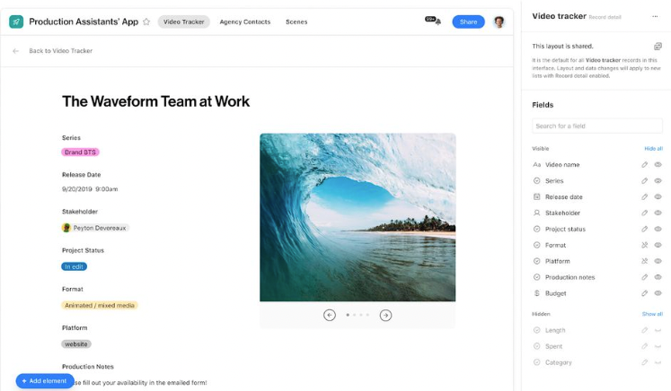
  2. Using text boxes for directions: Especially when you’re bringing people into an Airtable interface for the first time, I’ve seen customers build these impressive ‘here’s exactly what you need to do on this page’ type instructions that are really effective at outlining processes. These instruction boxes are also a fantastic way to provide contact instructions in case someone gets stuck (i.e. “email XYZ if you need help” or “If you have a question, don’t hesitate to jump into this Slack channel #XYZ”)
  3. Surfacing comments: One of my all-time favorite things about Airtable is how every record has an activity trail that keeps track of not only changes to fields in that record but also comments entered by users. Giving people visibility into those comments from an interface and even letting them add their own is such a great way to centralize more of the workflow. It lets others who might need to weigh in not have to bounce between Slack or email to understand the “why” behind changes and updates.


kuovonne
18 - Pluto
18 - Pluto

When creating interfaces, start with the structure of the underlying data and your user's workflows. Sometimes clunky workflows are due to issues with the underlying schema. Trying to put a pretty interface on top and patching issues with automations to move data around will make the system more complex and harder to maintain. Start with a solid schema, clean data, and a clear understanding of what your users need to see and accomplish and everything flows from there.

Other specific techniques I use:
- Collaborator / user fields are you friend and make it much easier to show users just their own records.

- Put the minimum necessary filters on the actual data elements, and use a separate filter element with preset values to show the most commonly needed records. Users can then adjust the filters at run-time if they need to see slightly different records.

- Use button fields in grid views to enable navigation between linked records.  In the parent page, have a grid view of the linked records with button fields to jump to the full interface page of the linked record (versus a detail page). In the child page, have a button for opening up the full page of the parent record.

- When working with linked records there are several methods of showing those linked records. Design the information in each of those methods carefully. Will you show the linked record field as a pill with only the primary field value visible? As a card with the primary field plus a bit more info? As a grid view where you can preview several fields, directly edit fields, and push buttons? A gallery or other view? Will you use the side-sheet which can display even more information and also include clickable buttons? Will you also have a full-blown details page for the linked record? Make the most commonly needed fields immediately accessible, and make navigation to other data easy.

- If there are many pages in an interface, have a "Main Menu" interface page with buttons that open up the various interfaces pages. You can include annotations on which pages to use and why. Sub-pages can be hidden from the main bar of pages for a cleaner look. If you have a "Main Menu" table with collaborator fields, your main menu could even be dynamic for different users.

- Some users prefer to have read-only access to certain data fields so that they cannot accidentally make changes.

- When creating new records, decide how much data to include on the "New Record" form, and how much should wait until after the record is created and you have access to formula fields and lookups. This can also impact any automations that run on record creation.

- If you have data validation issues based on an interplay of record data, use a formula field that checks for these issues and warns when there are problems. (For example, if field1 has value1, make sure that field2 is also filled out with a number in the acceptable range.) I'll be discussing how to build such a formula at the DareTable conference next month!