Dec 23, 2023 10:15 AM
Hello,
I'd like to create a Digital Planner like this one. It seems the Interface Designer lack of feature or may be I don't know how to do it.
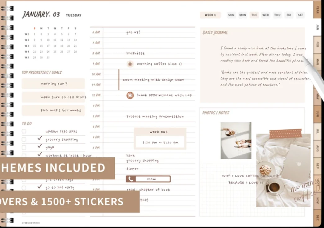
Any suggestion to improve the UI ?
Thanks !
Dec 23, 2023 03:37 PM
As of 2023, that sort of an interface is not possible with Airtable. You might want to look at Claris FileMaker, which is a database programming language that offers all of that right out of the box. I was one of the top FileMaker developers for 30 years before becoming an expert Airtable consultant, so feel free to reach out to me through my website if you need a referral to an excellent FileMaker developer.
Dec 24, 2023 01:14 AM
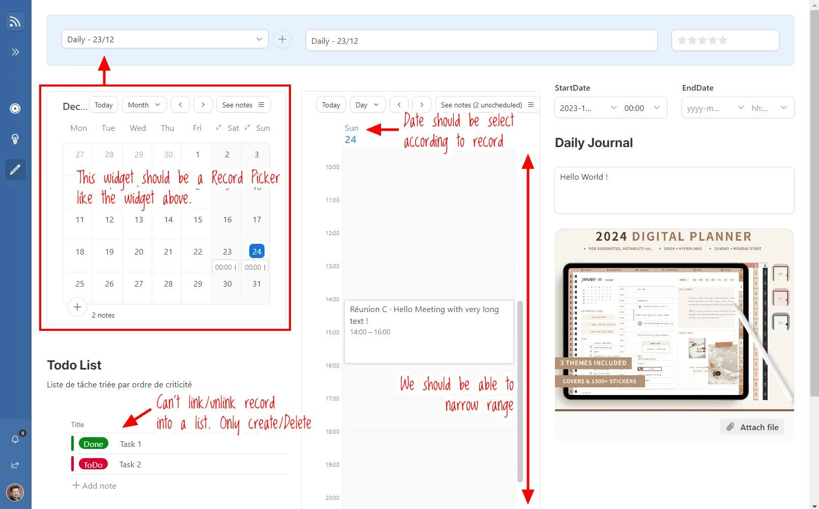
Thanks Scott, Claris looks cool (it brings me back 30 years ago on Mac, didn't know it evolve so much) but I won't change my stack (AirTable, NodeRed, Wordpres,...) , I believe it should be AirTable feature/improvement. And it almost works :
I really think AirTable team should finish the job with Calendar widget. Very small improvements.
Aside of that they need to work on more complicated task:
Dec 25, 2023 04:52 AM
Another easy feature, given the todo list (and all other widgets)
The ROI is that I can list all the TODO in the range of a start/end date of the picked record. That allow removing the reference between the Record and ToDo which is in some case very very clean.
Dec 25, 2023 08:59 AM - edited Dec 25, 2023 09:02 AM
Another buggy Interface feature:
I don't understand why AirTable teams didn't put the same behaviors for all these UI... It a limitation that doesn't seems legitimate.
Dec 25, 2023 02:38 PM
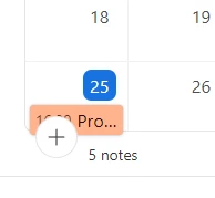
Yet another bug ...
It's an issue because this big [+] button bring user outside of the interface and create row that has no configuration, templates, etc ... where the smaller one could at least be edited to match filter conditions.
Dec 27, 2023 04:17 PM
Another weird behavior, in a list there is a checkbox, playing with UI it might keep or lost the check value. There is no action to perform on checked elements ?