- Mark as New
- Bookmark
- Subscribe
- Subscribe to RSS Feed
- Permalink
- Report Inappropriate Content
Jul 14, 2023 12:24 PM
I'm not sure who to direct this to, so I hope one of you can help.
I need to get some idea of what is going on with the changes that seem to be going on. I have a interface designed for a client, and finally have reached the point were I am getting to have them upgrade their production account. To get ready I needed to make some final changes based on their feedback using my test account.
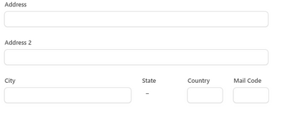
I needed to add some list pages with sidesheets that are where some fields are made editable. The ones I have on the existing test interface were easy to format and allowed resizing of the fields as well as positioning several on a line. A partial section looks like
With the changes that have been made all I can do is stack the fields with the labels to the left
This is totally unacceptable. I know it looks like a minor thing, but this was only the simplest example. When you multiply the issue over the number of fields and pages it's much more serious.
It's taken months to get everyone in agreement on how this is to look and behave, and now I can't deliver what they agreed upon.
Please let me know that you will be rolling back these changes.
- Mark as New
- Bookmark
- Subscribe
- Subscribe to RSS Feed
- Permalink
- Report Inappropriate Content
Aug 04, 2023 12:44 PM
@BillH wrote:I'm still not seeing the change. Was it only rolled out on enterprise? I lost the last project because of the "lack of stability of the platform", but still might be able to keep some others going.
It's slowly being rolled out to people. I think Airtable was traumatized from the reaction to the sidebar fiasco and decided to update things slowly and get feedback before changes are made more widespread.
- Mark as New
- Bookmark
- Subscribe
- Subscribe to RSS Feed
- Permalink
- Report Inappropriate Content
Aug 04, 2023 12:45 PM
Hi everyone — Micah here from the product team at Airtable. I wanted to follow-up with this group and share a few more details and updates on the new layout. First, I want to take another moment to acknowledge and thank you for your recent feedback on this release. We’re continuing to build and expand our product and as we continue to work on our roadmap, we want to make sure that you are aware of our changes. We heard your feedback loud and clear and here are some of the immediate steps we’re taking to address some of your concerns:
- We are working swiftly on a follow-up update to make the layout more customizable
You’ll see some of these updates begin to land starting at the end of this month:
- Field duplication and deletion will be available directly on the record detail canvas
- Rows and columns will be more customizable
- Gray tinting will be added to visually separate information
- Field helper text will be available on interfaces
- …and more to come down the road.
- While we work on adding more functionality, we are providing a way to revert to the legacy format
While we don't intend for this to be a permanent solution, we recognize that the old layout provided a level of functionality and customization that the new layout currently does not have. Our goal is to continue adding more flexible functionality to the new layout. We hope you'll continue to give us feedback so that we can deliver the best possible experience to you.
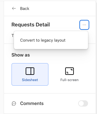
Once you create a new Record Detail layout, you can navigate to the “...” next to “Record Details” at the top of the page to convert the page to the legacy format. You will be prompted to confirm if you want to make the switch for this page. Note: once you switch a page to the legacy layout you will not be able to switch back to the new layout.
We know there's a lot more to do here and we’re committed to adding more to this experience. Ultimately, we want to make building with these new layouts easier while still retaining the customization that you all need.
We’ll provide more updates as some of these enhancements land, but please continue to surface any feedback you may have — it’s extremely important to us. Thank you again for your understanding and patience.
- Mark as New
- Bookmark
- Subscribe
- Subscribe to RSS Feed
- Permalink
- Report Inappropriate Content
Aug 04, 2023 01:48 PM
Thank you guys for restoring the legacy option while the kinks are worked out of the new system.
- Mark as New
- Bookmark
- Subscribe
- Subscribe to RSS Feed
- Permalink
- Report Inappropriate Content
Aug 05, 2023 01:37 AM
@MicahRoberson Thank you and please implement the "legacy option" as standard operating procedure @ airtable, when introducing big changes like this. Please take this seriously. We are all so tired of these upsets. So unnecessary for everyone. Thank you.
- Mark as New
- Bookmark
- Subscribe
- Subscribe to RSS Feed
- Permalink
- Report Inappropriate Content
Aug 05, 2023 04:14 AM
@MicahRoberson You’re halfway there. We also need this same ability immediately to roll back the new home screen as well. Not only is the new home screen riddled with bugs, but it is absolutely impossible for anybody to find anything anymore. The new Home Screen has destroyed everyone’s productivity, and it is absolutely SHOCKING that Airtable would even roll it out after 6 months of complaints about it from users, after 6 months of complaints about it from consultants, and after 6 months of negative threads about it in these forums.
- Mark as New
- Bookmark
- Subscribe
- Subscribe to RSS Feed
- Permalink
- Report Inappropriate Content
Nov 02, 2023 02:20 AM
Thank you for the legacy option, but please god stop removing core functionality in the future. The value proposition of Airtable is its ease of use compared to a traditional database and separate front end. Please don't keep chipping away at that value prop - paying customers can only be stretched so far.
- « Previous
- Next »


