The Community will be undergoing maintenance from Friday February 21 - Friday, February 29 and will be "read only" during this time. To learn more, check out our Announcements blog post.
- Airtable Community
- Discussions
- Ask A Question
- Interface Designer
- Click on chart to show record list in Interface
- Subscribe to RSS Feed
- Mark Topic as New
- Mark Topic as Read
- Float this Topic for Current User
- Bookmark
- Subscribe
- Mute
- Printer Friendly Page
Click on chart to show record list in Interface
- Mark as New
- Bookmark
- Subscribe
- Subscribe to RSS Feed
- Permalink
- Report Inappropriate Content
May 25, 2022 09:04 AM
When you’re using apps, you can click on a bar on a chart and it’ll pop up a window that shows all the records in that particular bar. How do I do this in interfaces? Am I missing a setting? Right now charts aren’t interactive at all.
- Mark as New
- Bookmark
- Subscribe
- Subscribe to RSS Feed
- Permalink
- Report Inappropriate Content
May 25, 2022 10:01 PM
I, too, would like to know whether this is possible!
- Mark as New
- Bookmark
- Subscribe
- Subscribe to RSS Feed
- Permalink
- Report Inappropriate Content
Sep 18, 2022 07:35 AM
Is there any update on this? I too would like to click on a chart and see through the records a particular segment or bar represents (besides for the basic data when hovering over with the mouse)
Any solutions would be extremely welcome!!
- Mark as New
- Bookmark
- Subscribe
- Subscribe to RSS Feed
- Permalink
- Report Inappropriate Content
May 31, 2023 05:16 PM
I am also looking for this! Not very helpful if we are seeing data in a chart if we can't drill in from that view. Right now we have to go search for the relevant tickets.
- Mark as New
- Bookmark
- Subscribe
- Subscribe to RSS Feed
- Permalink
- Report Inappropriate Content
Jun 16, 2023 08:49 AM
This is not currently available so please submit a suggestion ticket. PowerBI does this well where you can also link other elements on the page together as filters, so whatever you click can filter the other lists and charts.
- Mark as New
- Bookmark
- Subscribe
- Subscribe to RSS Feed
- Permalink
- Report Inappropriate Content
Feb 08, 2024 12:58 PM
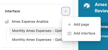
It's been a while since somebody last asked this, but it does look like it is now possible to do this when you create the interface by first adding a page and then adding individual graphs/charts.
The layout of the charts/graphs do work differently, i'm still trying to get a hang of the dashboard inside the page layout, but it let's me drill down!
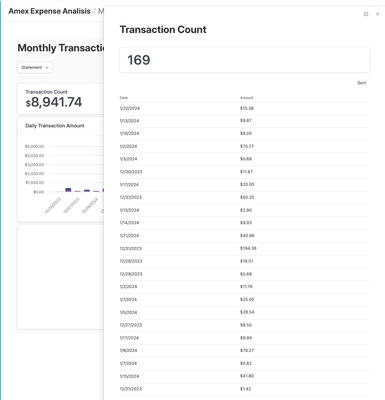
Here is an example of a "Number" type configured to see underlying transactions:
And this is what happens when i click into it on the published interface. You can select what columns are visible or even if the vieiwer can further see the details
Hope this helps others looking for this functionality!
- Mark as New
- Bookmark
- Subscribe
- Subscribe to RSS Feed
- Permalink
- Report Inappropriate Content
Feb 09, 2024 11:39 AM
Wow thanks for circling back on this. I haven't explored the New dashboard page, so this is very interesting.
One downside I see with New dashboards is it only allows you to link to 1 table. I have dashboards that pull aggregates from several tables. So you're either stuck with "blank" pages which don't have this click thru or you have to stick with 1 table.
- Mark as New
- Bookmark
- Subscribe
- Subscribe to RSS Feed
- Permalink
- Report Inappropriate Content
Jul 17, 2024 11:38 AM
I'm not sure when this feature was added, but for "Dashboard" pages in Airtable Interfaces you can show data from multiple tables in the same base. After the initial creation of the Dashboard page you can scroll to the button and hover your cursor over the bottom center of the page to reveal a "+ Add group" button (note this button is different from the "+" button which appears at the bottom center of a group and is for adding new elements from the same group). This will allow you to link to a different table from your base and add new elements from that table in a group. There are still some limitations in formatting because all numbers, chart, pivot tables, etc. from the same group must stay together. But this essentially lets you stack multiple dashboards together on the same interface page.
- Mark as New
- Bookmark
- Subscribe
- Subscribe to RSS Feed
- Permalink
- Report Inappropriate Content
Jul 17, 2024 02:43 PM
So happy this is now live, I re-built all of our dashes to be on the new functionality, and the teams love it! The dashboards are much more useful now that they are interactive. Thanks!!


