- Mark as New
- Bookmark
- Subscribe
- Subscribe to RSS Feed
- Permalink
- Report Inappropriate Content
Dec 07, 2023 11:16 AM
Today there was an update called Refreshed linked record picker in Interfaces which makes the record picker for linked fields more compact and consistent. I like the idea, but it breaks some important things in our workflow.
Namely, it does not show images, and it truncates the record names.
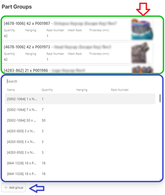
Here you can see a snippet of an interface which shows a linked field. There are a few records already linked (circled in green) with image thumbnails appearing on the right side of the card (red arrow). Clicking the "Add group" button opens the new record picker (circled in blue) which severely truncates the record name and does not show image thumbnails.
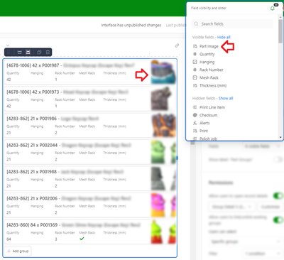
To confirm the configuration of this field, here are the settings which show that "Part Image" is the first visible field. (Regardless of the position, it always shows up to the right on the cards, which is a handy feature. Here I put it first in line to try to force it to show up in the new record picker.)
The update states "We've updated the linked record picker in Interfaces, now featuring a streamlined UI, width-resizability, and enhanced usability for single-select linked records."
Does anyone know how to resize the width so that I can avoid truncating my record name? Is it possible to have image thumbnails show in the new record picker? Without those features, my interface has become unusable.
- Mark as New
- Bookmark
- Subscribe
- Subscribe to RSS Feed
- Permalink
- Report Inappropriate Content
Dec 07, 2023 11:18 AM
Agreed to those questions! Also, with the new linked record picker, not all of my users can now add new records, despite it being enabled as an option for that field. I submitted a trouble ticket with Airtable support about it (00673453).
- Mark as New
- Bookmark
- Subscribe
- Subscribe to RSS Feed
- Permalink
- Report Inappropriate Content
Dec 07, 2023 11:22 AM
I was also confused about adding records, since the + button disappeared, but found that you just have to start typing to see the option to create a new record.
Not ideal for workflows like this one where I want users to create a new record every time--and the record creation form is not sufficient since it does not automatically link records based on the context.
- Mark as New
- Bookmark
- Subscribe
- Subscribe to RSS Feed
- Permalink
- Report Inappropriate Content
Dec 07, 2023 11:29 AM
That's a helpful workaround, but definitely not ideal.
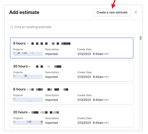
Most of my users see a UI like the one in your screenshot, but in my account, I see something different - see below.
I checked and this does not appear to be a permissions (Editor vs Creator) issue. It could be a rollout issue, not sure.
- Mark as New
- Bookmark
- Subscribe
- Subscribe to RSS Feed
- Permalink
- Report Inappropriate Content
Dec 07, 2023 04:12 PM
Agreed that the button up top was a better implementation, and I hope we can bring that back.
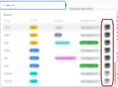
In other news, I fiddled around and realized that it does show images if the field is an attachment. It does not show images if the field is a lookup.
So I'm hoping this is a bug/oversight and we can get them to show up regardless of the field type.
- Mark as New
- Bookmark
- Subscribe
- Subscribe to RSS Feed
- Permalink
- Report Inappropriate Content
Dec 07, 2023 08:55 PM
I just received a response form Airtable Support:
I've received an update from my team and it appears that this was indeed an intended change surrounding the updated linked record picker. At this time, collaborators will need to first type in the search bar before being given the option to create a new record.
For context, this change was made to reduce data duplication and ensure collaborators are checking for existing options before record creation. The search query is automatically used for the created record and this pattern more closely matches what creation in dropdowns looks like elsewhere in Airtable.
Since this change is currently being rolled out in increments, these inconsistencies you're noticing between accounts in this interface are expected. You should expect to see this refreshed record picker on your account shortly. If you have any feedback you'd like to share regarding this new functionality, I'd be happy to pass this along to my team!
Definitely not great news...
- Mark as New
- Bookmark
- Subscribe
- Subscribe to RSS Feed
- Permalink
- Report Inappropriate Content
Dec 07, 2023 09:10 PM
While the inadvertent creation of duplicate records is a problem for many bases, forcing users to always type in the search bar before being able to create new records is a strange decision. There are plenty of situations where a creating a new record is always the desired action versus linking to an existing record. This is one reason why solving issues can be difficult--the ideal solution for one person might break the workflow for someone else.
- Mark as New
- Bookmark
- Subscribe
- Subscribe to RSS Feed
- Permalink
- Report Inappropriate Content
Dec 08, 2023 06:07 AM
How many times have we seen this play out? How long before Airtable realizes two essential requirements exist for new feature changes?
- Opt-in vs default opt-out as it applies to all new UI/UX changes.
- Snapshot-in-time instances that are impervious to upgrades.
These are both ancient ideas in use by many SaaS platforms. Airtable is running out of toes to shoot off.
- Mark as New
- Bookmark
- Subscribe
- Subscribe to RSS Feed
- Permalink
- Report Inappropriate Content
Dec 08, 2023 11:53 AM
Wow. Another terrible update from Airtable.
- Mark as New
- Bookmark
- Subscribe
- Subscribe to RSS Feed
- Permalink
- Report Inappropriate Content
Dec 11, 2023 03:05 PM
Hi @Calvin_Young2, we have a fix going out today for showing images from lookup fields, but let us know if you run into any other issues around this. As for resizing the picker, you can click and drag the bottom right corner of the popover to adjust its width.


