Comment Post Options
- Mark as New
- Bookmark
- Subscribe
- Subscribe to RSS Feed
- Permalink
- Report Inappropriate Content
Feb 13, 2024 04:41 AM
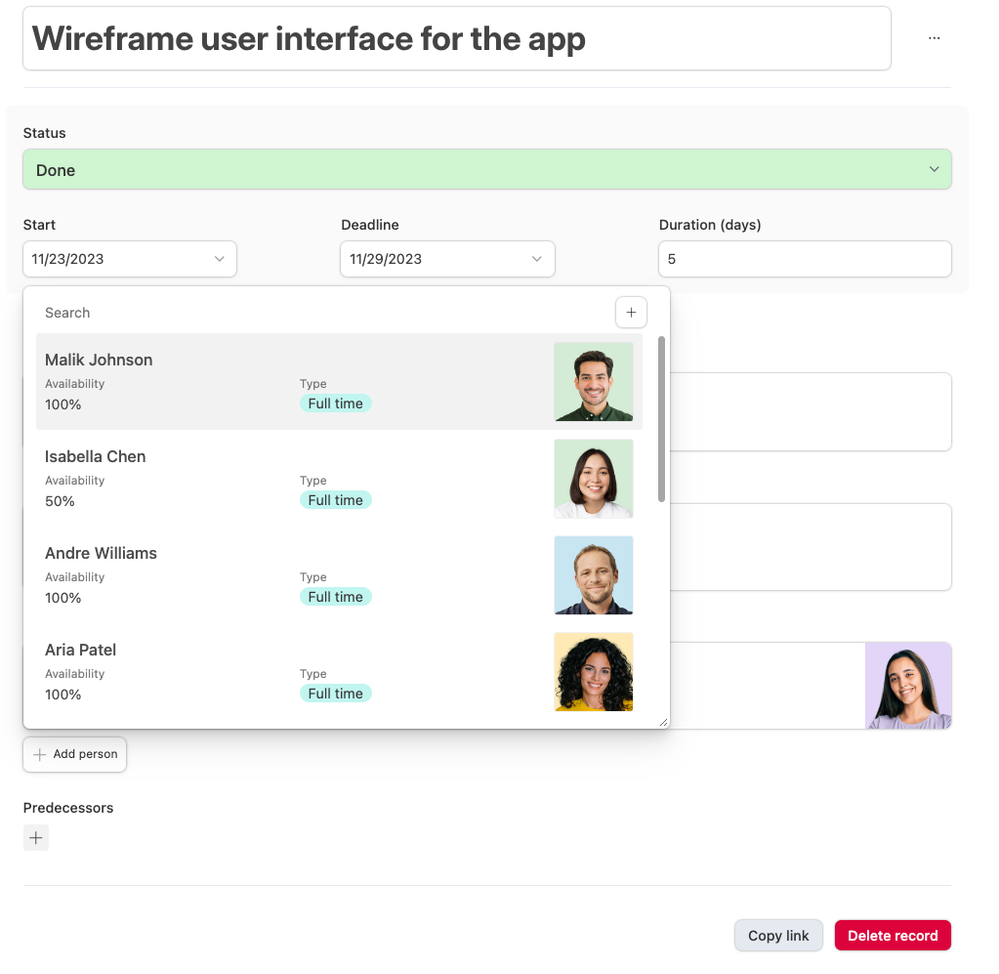
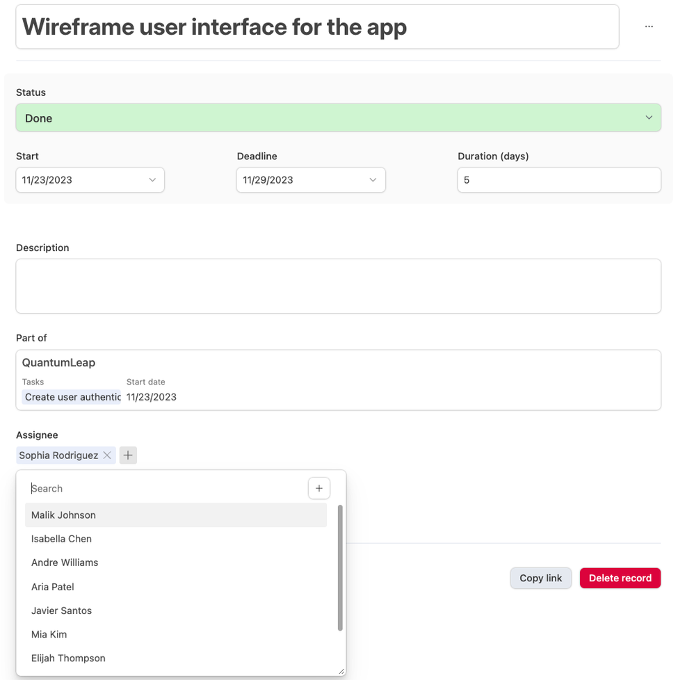
Hi all, today we’re beginning to roll out some redesigns to the linked record picker in Interfaces. These redesigns should make it easier to identify the data you need to make a selection, reduce some unnecessary clutter, and bring a more flexible experience as you can now easily resize it to fit your screen real estate needs. This redesign unlocks some future features for linked records, so stay tuned for more soon!
Reply
1 Reply 1
Comment Post Options
- Mark as New
- Bookmark
- Subscribe
- Subscribe to RSS Feed
- Permalink
- Report Inappropriate Content
Feb 13, 2024 07:27 AM - edited Feb 13, 2024 07:28 AM
Nice update. Feels sleek to me.


