- Airtable Community
- Discussions
- Ask A Question
- Interface Designer
- Re: Request — and a workaround for the time being
- Subscribe to RSS Feed
- Mark Topic as New
- Mark Topic as Read
- Float this Topic for Current User
- Bookmark
- Subscribe
- Mute
- Printer Friendly Page
Re: Request — and a workaround for the time being
- Mark as New
- Bookmark
- Subscribe
- Subscribe to RSS Feed
- Permalink
- Report Inappropriate Content
Nov 15, 2021 10:58 AM
The problem: long details page loses name of record’s subject
On an interface page that shows record details for a person (say), if there are more fields than be displayed on one page, user will be required to scroll and scrolling will cause the name of the record to scroll up and out of view.
Requested solution
Would be extremely useful to have a Header option for interface pages. (As far as I can tell, there is no Header option at the moment.)
Workaround I’m using
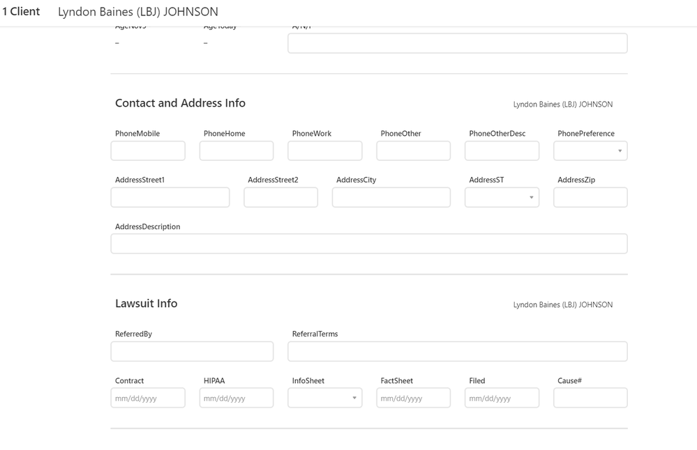
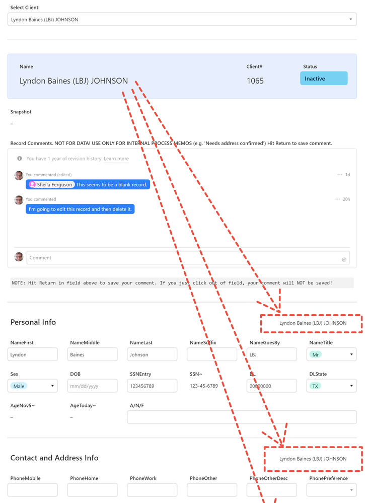
At top of the page is a sort of title area that shows the name of the record (+ client# and status). Below that, I’ve divided the page into sections. Each section has a heading. To the right of each section heading, I repeat the name of the record. See screen capture below. The arrows are intended to show that the record name (“Lyndon Johnson”) gets repeated below and continues to get repeated below and offscreen if user scrolls further down to new sections.
This is not a perfect workaround. If a section is tall enough, it’s possible that the repetition of the name might scroll up and out of sight before the next repetition appears at the bottom. Best I can come up with now however and so far seems to be working.
Anyway, Interfaces is working very nicely and I know it’s beta. Hope before next year we get something like a header or floating or fixed-position object that I can put the record name into.
- Mark as New
- Bookmark
- Subscribe
- Subscribe to RSS Feed
- Permalink
- Report Inappropriate Content
Nov 20, 2021 08:55 PM
There’s already a header available, and you can add up to three rows of elements in it. Some layouts may not show the header area right away, but if you drag an element to the very top of the layout, the header space appears and you can drop the element into it.
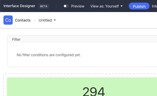
For example, here’s the default look for the top of the dashboard layout:
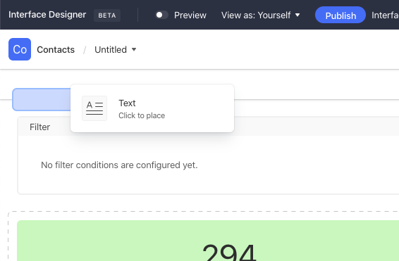
Say I want to add a text element as a header. I select the text element and drag it to the top. Notice how a new space appears between the built-in interface header and the top element (the filter row in this case):
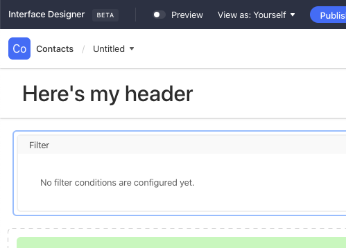
Drop the element there, then style it as desired:
Placing elements in the header feels a bit more finicky than placing them in the main interface layout, but as with all things, it becomes easier with practice.
It’s also important to note that if you add record fields to the header, you won’t be able to switch them to edit mode. Header content is for display only.
As another example, here’s the header that I built for a Contacts interface:
- Mark as New
- Bookmark
- Subscribe
- Subscribe to RSS Feed
- Permalink
- Report Inappropriate Content
Nov 21, 2021 11:20 AM
Excellent, Justin — thank you so much for pointing this out! I think I’ll keep (at least for now) my repeated record names at the right of each new section, just to make it clear as possible to users what record they’re editing. But thanks for your tip, I’ve now added a header on that interface as well. This screenshot shows the page scrolled down about halfway:
Now it’s not (yet) ideal. I didn’t have much trouble placing objects in the header. My complaint is that I can’t control the alignment of the objects at all. If you look at my screenshot, you can see that I have placed all of the content objects in the middle of the page (leaving wide margins). Unfortunately the stuff up in the header is jammed over to the left and there does not seem to be anything I can do about it (again: at the moment).
One last point: I’m slightly embarrassed that I didn’t realize this, but in my defense I want to point out that I have studied the tools carefully, didn’t find any hints, and there is no mention of this feature in the documentation for Interfaces found [here]( Interface Designer – Airtable Support). This is an important design element and might be good to have a short paragraph summarizing your excellent explanation.
But as they saying goes, “Half a loaf is better than none” and this is more than half a loaf. Thanks again, Justin.
