- Mark as New
- Bookmark
- Subscribe
- Subscribe to RSS Feed
- Permalink
- Report Inappropriate Content
Nov 14, 2021 08:45 AM
I believe this will be a fairly common request and it’s something I noticed right off the bat when designing a dashboard interface for one of my “aggregation tables” for an e-commerce store that’s being fed data from Shopify.
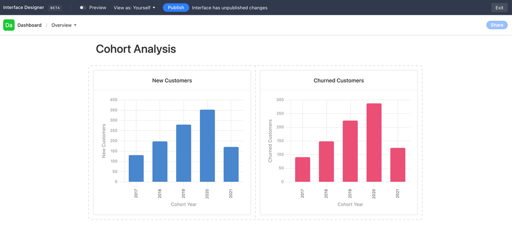
Use Case: New Customers vs. Churned Customers in a given Cohort Year
Currently, it seems I have to create two separate charts, like so…
Ideally, I would like to lay these two charts “on top of each other.” They’re both drawing data from the same table, so the X-Axis is the same. The Y-Axis is just 2 different columns’ values in the same table & rows.
- Mark as New
- Bookmark
- Subscribe
- Subscribe to RSS Feed
- Permalink
- Report Inappropriate Content
Nov 14, 2021 12:45 PM
I found the Airtable chart app a little too simplistic - your best bet is to reach out to Airtable Support with a new Feature Request.
Until then, look into the App Vega-lite, although I can’t advise if it’ll structure your chart exactly as desired - I suspect it will. The main problem with Vega-lite is that you’ll need to read the manual, and from my experience it’s not very beginner friendly, however if you have a weekend or two to spare then you’ll hopefully achieve the result you’re after.
Erk, just realised though - I don’t think Vega-Lite can display on the new AT Interface… so back to putting more pressure on Support for both Chart improvements AND supporting Vega-lite in the new Interface.
- Mark as New
- Bookmark
- Subscribe
- Subscribe to RSS Feed
- Permalink
- Report Inappropriate Content
Nov 20, 2021 03:04 PM
Welcome to the community, @Brian_Gumm2! :grinning_face_with_big_eyes: This might be doable if you can get the data into a single field, but that depends on the field. (I built a chart the other day that had overlapping values depending on the field content, which is why I think this could work under the right circumstances.)
Before going farther down that road, though, I need to ask: what two field types are currently driving those charts?
- Mark as New
- Bookmark
- Subscribe
- Subscribe to RSS Feed
- Permalink
- Report Inappropriate Content
Jan 18, 2022 03:18 PM
Yes! My use case scenario is a little different, but essentially I need the same thing you’ve requested.
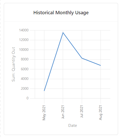
I’m searching for a way to display multiple lines of data in a line chart on Interface Designer. Here is an example of the type of chart of I’ve been able to configure so far to show usage of an inventory item using the date field (bucketed by month) for the X-axis and the “Quantity Out” field (sum) for the Y-axis:
Ideally I would like to be able to add more lines to this chart in two ways:
-
Select a related field as a source for another line on the Y-axis – for instance, show the “Quantity Out” as one line and the “Quantity In” as a separate line (in this case, the label for the Y-axis would simply be “Quantity”). In theory, this approach should support several sources for the Y-axis as long as they all used the same field type.
-
Set parameters to show a different set of data from the same field that is already being used for the Y-axis – for instance, show FY21 as one line and FY22 as a separate line (in this case, the labels for the X-Axis would still include the month names but no year). This could also be designated by another field if necessary (i.e. I could set up a formula or an automation to categorize each record into the correct “Fiscal Year” and use that field to set the parameters for which records would be summarized into which line, but I would still need a way to configure the chart so that it would look for both the data source field (“Quantity Out”) and the category/parameters field (“Fiscal Year”), which would most likely be a single-select field.
Is there a way to do this? For the sake of simplicity I’ve only listed one example here, but I already have half a dozen use case scenarios waiting for development in Interface that will require the same kind of functionality.
- Mark as New
- Bookmark
- Subscribe
- Subscribe to RSS Feed
- Permalink
- Report Inappropriate Content
Jan 19, 2022 08:49 AM
I’d love to hear more about this chart! Would something similar be possible in the scenario I shared?
- Mark as New
- Bookmark
- Subscribe
- Subscribe to RSS Feed
- Permalink
- Report Inappropriate Content
Jan 19, 2022 10:10 AM
Full transparency: I rarely use charts, and unfortunately I can’t recall a) what situation led me to make the chart that I described or b) where that chart might be located (if it still exists; sometimes I’ll make something as a test, then delete it because it was just a test). If I happen to find it, I’ll let you know, but I can’t promise anything.
- Mark as New
- Bookmark
- Subscribe
- Subscribe to RSS Feed
- Permalink
- Report Inappropriate Content
Jan 19, 2022 10:30 AM
Fair enough. Thanks for responding nevertheless. :blush:
- Mark as New
- Bookmark
- Subscribe
- Subscribe to RSS Feed
- Permalink
- Report Inappropriate Content
Apr 20, 2022 09:35 PM
You could show new vs churned as two separate lines on the same chart. Let me know if this is helpful and I can show you the underlying table structure to achieve this.
- Mark as New
- Bookmark
- Subscribe
- Subscribe to RSS Feed
- Permalink
- Report Inappropriate Content
Apr 21, 2022 01:04 AM
Would love to know how you structured that !
- Mark as New
- Bookmark
- Subscribe
- Subscribe to RSS Feed
- Permalink
- Report Inappropriate Content
Apr 24, 2022 07:44 PM
You start with your set of records and tag them as “primary records”. You then need to duplicate the primary records for any dimension that you want to see on the chart. In this case, I have created two duplicate sets of records and tagged them as “new” and “churned”. The new/churned records then need to be linked to the primary records so you can do the relevant roll up. After linking the new/churned records, you do your roll ups, then put all values into one column with this formula: IF({Record Type}=“New”,{New (roll up)},IF({Record Type}=“Churned”,{Churned (roll up)},BLANK())). In interface designer, put the “Customer numbers” field on the Y axis and group it by the “Record type”. Hope that helps.


