- Airtable Community
- Discussions
- Ask A Question
- Interface Designer
- Re: Worst trash can ever
- Subscribe to RSS Feed
- Mark Topic as New
- Mark Topic as Read
- Float this Topic for Current User
- Bookmark
- Subscribe
- Mute
- Printer Friendly Page
Re: Worst trash can ever
- Mark as New
- Bookmark
- Subscribe
- Subscribe to RSS Feed
- Permalink
- Report Inappropriate Content
May 19, 2023 01:26 PM
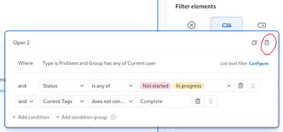
Is it just me or is this the worst placed delete button ever? That's where the close button goes, guys... Good job there's an undo feature!
Solved! Go to Solution.
Accepted Solutions
- Mark as New
- Bookmark
- Subscribe
- Subscribe to RSS Feed
- Permalink
- Report Inappropriate Content
May 23, 2023 06:48 AM
Thanks so much for the feedback regarding the trash can icon being in the top right corner (where typically the close button would go). I've shared your feedback with our team and we are currently thinking through ways of redesigning this menu so that the delete button will not live in the top right corner. We don't yet have a scheduled release time for this redesign, but please know that we heard your feedback and are working to change this soon 👍
- Mark as New
- Bookmark
- Subscribe
- Subscribe to RSS Feed
- Permalink
- Report Inappropriate Content
May 23, 2023 06:52 AM
I appreciate the reply and I always look forward to Airtable's ongoing improvements. ❤️

