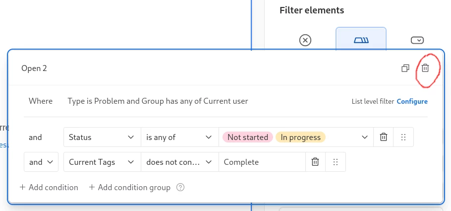
Is it just me or is this the worst placed delete button ever? That's where the close button goes, guys... Good job there's an undo feature!

Is it just me or is this the worst placed delete button ever? That's where the close button goes, guys... Good job there's an undo feature!

Best answer by Vic_Airtable
Thanks so much for the feedback regarding the trash can icon being in the top right corner (where typically the close button would go). I've shared your feedback with our team and we are currently thinking through ways of redesigning this menu so that the delete button will not live in the top right corner. We don't yet have a scheduled release time for this redesign, but please know that we heard your feedback and are working to change this soon 👍
Enter your E-mail address. We'll send you an e-mail with instructions to reset your password.