Comment Post Options
- Mark as New
- Bookmark
- Subscribe
- Subscribe to RSS Feed
- Permalink
- Report Inappropriate Content
May 02, 2021 04:40 PM
Hi team,
Is there a way to create a stacked bar chart that goes to 100%; i.e. showing the % split of records instead of simply the absolute count of records.
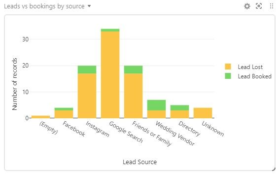
I have this chart to roughly measure conversion rate from various sources;
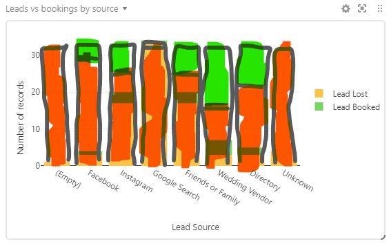
But it would be even better if each bar extended to 100% and instead showed the percentage of records from each source that either booked or were lost.
Is it possible to create something like this; either by manipulating the data via formula, or with a chart/app option that I’m missing?
1 Reply 1
Comment Post Options
- Mark as New
- Bookmark
- Subscribe
- Subscribe to RSS Feed
- Permalink
- Report Inappropriate Content
May 04, 2021 05:11 AM
Yes - play with Vega-Lite.


