- Airtable Community
- Discussions
- Ask A Question
- Other questions
- Re: Building Reports and Visualizations from Data ...
- Subscribe to RSS Feed
- Mark Topic as New
- Mark Topic as Read
- Float this Topic for Current User
- Bookmark
- Subscribe
- Mute
- Printer Friendly Page
Re: Building Reports and Visualizations from Data in Base
- Mark as New
- Bookmark
- Subscribe
- Subscribe to RSS Feed
- Permalink
- Report Inappropriate Content
Nov 06, 2022 01:45 PM
Hi all!
I’m using Airtable as a repository for a bunch of business data and am starting to think about how I present that data back to parts of our business so that we can make decisions from it.
To do that, I’m imagining creating a few different dashboards that use various segments of the data. Each dashboard will need different charts and tables that are based on the data (sometimes straight up, sometimes in aggregate – e.g. added across days). Ideally, I can somehow manage permissions across those reports, so that certain users can see some reports but not others.
I’ve tried using Airbase’s Interface Designer (too limited in terms of data presentation) and Data Studio (super slow and janky). Has anyone else been able to achieve something like this?
- Mark as New
- Bookmark
- Subscribe
- Subscribe to RSS Feed
- Permalink
- Report Inappropriate Content
Nov 06, 2022 02:04 PM
Welcome to the community, @philc!
I do not have any personal experience with these tools that create dashboards & charts & graphs, but I’ve heard good things about these 4 tools: DataBox, Image-Charts, QuickChart, and PowerBi.
All of these tools can be automated with scripting, DataFetcher, or Make. (Make is low-code/no-code, so it doesn’t require any knowledge of coding).
And I just recently learned that DocuMint natively supports QuickChart (or any other dashboard service that creates visualizations with just a URL) when creating PDF files: Add charts to your Documents with QuickChart.io - Help Center
- Mark as New
- Bookmark
- Subscribe
- Subscribe to RSS Feed
- Permalink
- Report Inappropriate Content
Nov 06, 2022 04:25 PM
Imagine your dashboard is simply various collections of records each in its own view and easily exposed to classes of data consumers in your organization. The challenge, then, is how do you make a record act as a proxy for data visualization(s)?
The integrated chart extension is a possible pathway as are other things @ScottWorld mentions. I tend to recommend this approach because it is simple, easy to implement with off-the-shelf formulas in many cases and also quite suitable for script processing. The only downside - the charts are not interactive, and this leads us full circle - you need to express your requirements with greater clarity to get recommendations.
We only know you want dashboards that are secure. I can think of 50 other questions to ask before rendering a pathway with any confidence.
Indeed, but not if you pre-process all of the component images in attachment fields and then render in a purdy Interface.
Highly not recommended; the effort required to integrate and configure data visuals is too steep and the results are poor.
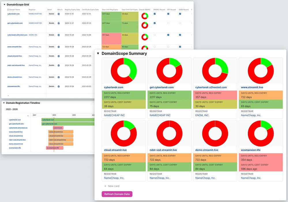
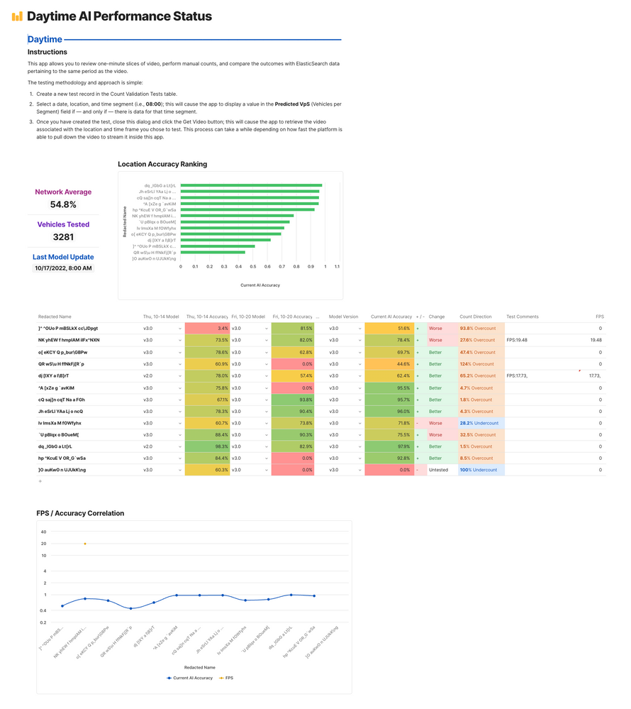
Um, yeah - many different examples come to mind, including Coda. :winking_face: These examples use QuickChart.io (as @ScottWorld mentioned). But I’m a little biased because every data visualization project I’ve done has an element of textual/narrative/assertion/assessment in them, so I need more than Airtable generally has to over from a data science perspective. Airtable can do almost everything you see in these examples and a whole lot more with QuickChart.


