- Airtable Community
- Discussions
- Ask A Question
- Other questions
- Re: Change graph colors?
- Subscribe to RSS Feed
- Mark Topic as New
- Mark Topic as Read
- Float this Topic for Current User
- Bookmark
- Subscribe
- Mute
- Printer Friendly Page
Re: Change graph colors?
- Mark as New
- Bookmark
- Subscribe
- Subscribe to RSS Feed
- Permalink
- Report Inappropriate Content
Nov 14, 2019 01:32 PM
Hey all! I’m trying to find a way to change the colors of a bar graph. Is there a simple way to do this that I’m missing??
Use Case: I have a graph showing the number of students enrolled in a program each day of the week, grouped by gender (using a 2-gender structure). In every other gender comparison graph I’ve made, it’s defaulted to pink and blue for the colors, but this graph insists on being yellow and green.
Any ideas?
- Mark as New
- Bookmark
- Subscribe
- Subscribe to RSS Feed
- Permalink
- Report Inappropriate Content
Nov 14, 2019 01:48 PM
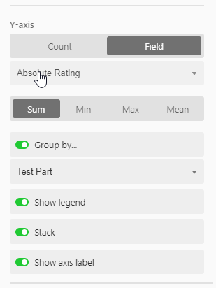
Use the “Group by…” option on the Y axis.
Group by the same field you are already using (gender).
Select “Stack”.
I think that should use the colors you used for your single select field… maybe not :man_shrugging:
Worth a try.
- Mark as New
- Bookmark
- Subscribe
- Subscribe to RSS Feed
- Permalink
- Report Inappropriate Content
Nov 14, 2019 03:10 PM
That’s how I have it set up right now, except for stacking it. I did try stacking it to see if it changed, but it’s still determined to stay yellow and green.
- Mark as New
- Bookmark
- Subscribe
- Subscribe to RSS Feed
- Permalink
- Report Inappropriate Content
Nov 14, 2019 04:08 PM
Are you using the colors Blue and Pink for the Single Select gender options in the Field the chart is based on? I thought the colors for that pulled from the colors you selected for the options in the Single Select field.
- Mark as New
- Bookmark
- Subscribe
- Subscribe to RSS Feed
- Permalink
- Report Inappropriate Content
Nov 14, 2019 05:55 PM
Aha! My answer was going to be “Yes, of course” but then I realized:
The gender field is a color coded single select field on Table 1, pulled into Table 2 via lookup. The days of the week field is a multi-select field on Table 2.
So if I base the graph on Table 2, the gender field isn’t properly color coded. But if I base it on Table 1 with a days of the week lookup, I lose the differentiation between days…
So is there a way for me to fix this without having to re-enter the information from either field?
- Mark as New
- Bookmark
- Subscribe
- Subscribe to RSS Feed
- Permalink
- Report Inappropriate Content
Nov 15, 2019 06:57 AM
I don’t think so. When you pull the gender field into another table via lookup, you lose the colors from the Single Select.
- Mark as New
- Bookmark
- Subscribe
- Subscribe to RSS Feed
- Permalink
- Report Inappropriate Content
Nov 15, 2019 10:03 AM
That’s what I was afraid of. Thanks for all your help, though! At least I was able to figure out why the chart was behaving the way it is.

