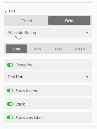
Use the “Group by…” option on the Y axis.
Group by the same field you are already using (gender).
Select “Stack”.
I think that should use the colors you used for your single select field… maybe not :man_shrugging:
Worth a try.

Use the “Group by…” option on the Y axis.
Group by the same field you are already using (gender).
Select “Stack”.
I think that should use the colors you used for your single select field… maybe not :man_shrugging:
Worth a try.

That’s how I have it set up right now, except for stacking it. I did try stacking it to see if it changed, but it’s still determined to stay yellow and green.
That’s how I have it set up right now, except for stacking it. I did try stacking it to see if it changed, but it’s still determined to stay yellow and green.
Are you using the colors Blue and Pink for the Single Select gender options in the Field the chart is based on? I thought the colors for that pulled from the colors you selected for the options in the Single Select field.
Are you using the colors Blue and Pink for the Single Select gender options in the Field the chart is based on? I thought the colors for that pulled from the colors you selected for the options in the Single Select field.
Aha! My answer was going to be “Yes, of course” but then I realized:
The gender field is a color coded single select field on Table 1, pulled into Table 2 via lookup. The days of the week field is a multi-select field on Table 2.
So if I base the graph on Table 2, the gender field isn’t properly color coded. But if I base it on Table 1 with a days of the week lookup, I lose the differentiation between days…
So is there a way for me to fix this without having to re-enter the information from either field?
I don’t think so. When you pull the gender field into another table via lookup, you lose the colors from the Single Select.
I don’t think so. When you pull the gender field into another table via lookup, you lose the colors from the Single Select.
That’s what I was afraid of. Thanks for all your help, though! At least I was able to figure out why the chart was behaving the way it is.

