- Airtable Community
- Discussions
- Ask A Question
- Other questions
- Re: Customize Gantt
- Subscribe to RSS Feed
- Mark Topic as New
- Mark Topic as Read
- Float this Topic for Current User
- Bookmark
- Subscribe
- Mute
- Printer Friendly Page
Re: Customize Gantt
- Mark as New
- Bookmark
- Subscribe
- Subscribe to RSS Feed
- Permalink
- Report Inappropriate Content
Mar 02, 2021 06:55 AM
Does anyone know if a Gantt Chart can be configured to show record names by people assigned? My base tracks class names and dates (the primary defining fields for the table) along with people who are assigned to each of those class instances. The people are assigned in a separate column. I’m able to configure a Gantt to show class names, based on the start and end dates. I can even add the assigned people’s names to the label. However, I’d like to show names of people on the left side of the chart, with date range along the top side of the chart, then color blocks would be instances that each person is teaching. I just can’t figure out how to get the left side to organize by person instead of by class.
Thank you for any advice!
- Mark as New
- Bookmark
- Subscribe
- Subscribe to RSS Feed
- Permalink
- Report Inappropriate Content
Mar 02, 2021 07:09 AM
I don’t believe it can, but Airtable provides an alternate pathway to custom visualizations using Vega-Lite. I believe using this new block it is possible to use the vast capabilities of Vega grammars to shape exactly what you want to display.
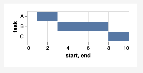
In a nutshell, a Gantt chart is really a class of bar chart whose bars do not start at ordinal zero. Armed with the Vega bar class, you can make almost anything imaginable.
This very simple example shows the data object in a simple Vega-Lite Gantt chart. You can even use the Vega-Lite editor to prototype the chart and then replace all except the data object in your block instance.
- Mark as New
- Bookmark
- Subscribe
- Subscribe to RSS Feed
- Permalink
- Report Inappropriate Content
Mar 02, 2021 07:17 AM
Below is a simplification of how my base is configured. I’m trying to get a visual with the person’s name on the left side and a block representing each class the person is teaching along a row with the date range along the top. Maybe Gantt isn’t the appropriate solution. Any thoughts are welcome! TIA!
Table 1 = Class Schedule
Column A = Class name (1st column),
Column B = start date
Column C = end date
Column D = Assigned Faculty (pulled from records in the People Table)
Table 2 = People List
Column A = Person’s Name
Column B = Teaching Class Instances (pulled from assignments in Class Schedule Table)
- Mark as New
- Bookmark
- Subscribe
- Subscribe to RSS Feed
- Permalink
- Report Inappropriate Content
Mar 03, 2021 09:39 AM
Possibly the case, but I would check out the latest Gantt View feature announced recently. I also created a simple GANTT-like chart using Vega-Lite block - needs a lot more work but I’m just too slammed right now to polish it.
This is the Vega-Light code -
{
  "$schema": "https://vega.github.io/schema/vega-lite/v4.json",
  "title": "Class Schedule",
  "width": "container",
  "height": "container",
  "mark": "bar",
  "encoding": {
    "y": {
      "field": "Class Name",
      "type" : "nominal"
    },
    "x": {
        "timeUnit": "yearmonthdate",
        "field": "Start Date",
        "type": "ordinal"
    },
    "x2": {
      "timeUnit": "yearmonthdate",
      "field": "End Date"
    }
  }
}- Mark as New
- Bookmark
- Subscribe
- Subscribe to RSS Feed
- Permalink
- Report Inappropriate Content
Mar 03, 2021 10:32 AM
Thank you! I will play around with this. From the picture you attached, is it possible to make the Assigned Faculty show on the left side menu, with the Class Name showing within the box inside the chart? I’m not very good with script writing, so I don’t even know if this is possible! Thanks again!
- Mark as New
- Bookmark
- Subscribe
- Subscribe to RSS Feed
- Permalink
- Report Inappropriate Content
Mar 03, 2021 11:50 AM
Yes, this is possible and where I was heading when I was interrupted by clients who pay a ton of money to distract me. Pretty much anything is possible with Vega.
Perhaps there are some other Vega-experts in the house that can chime in to get you further along.
- Mark as New
- Bookmark
- Subscribe
- Subscribe to RSS Feed
- Permalink
- Report Inappropriate Content
Mar 03, 2021 12:11 PM
Thank you! I appreciate you getting me going in the right direction and I appreciate your time :slightly_smiling_face:
- Mark as New
- Bookmark
- Subscribe
- Subscribe to RSS Feed
- Permalink
- Report Inappropriate Content
Mar 03, 2021 02:43 PM
The new Gantt View feature looks pretty awesome for non-coders.


