The Community will be undergoing maintenance on Friday January 10 at 2:00pm - Saturday January 11 at 2:00pm EST, and will be "read-only." For assistance during this time, please visit our Help Center.
- Airtable Community
- Discussions
- Ask A Question
- Other questions
- Re: Data labels in blocks
- Subscribe to RSS Feed
- Mark Topic as New
- Mark Topic as Read
- Float this Topic for Current User
- Bookmark
- Subscribe
- Mute
- Printer Friendly Page
Re: Data labels in blocks
- Mark as New
- Bookmark
- Subscribe
- Subscribe to RSS Feed
- Permalink
- Report Inappropriate Content
Jun 29, 2020 11:56 AM
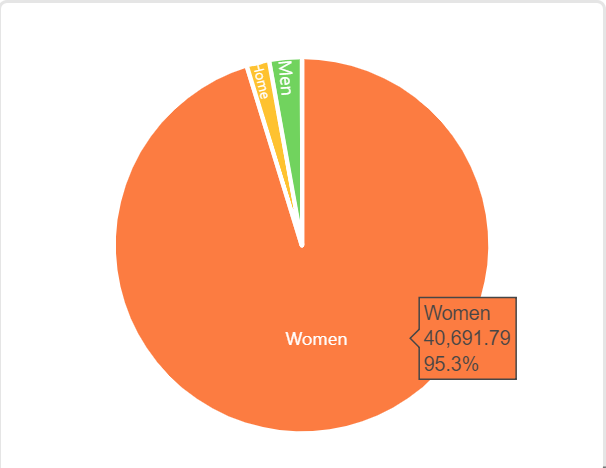
Hi, I’ve been trying to visualize data in blocks using charts and was wondering if there’s a way to add data labels to these charts. For example, if I make a pie chart, is there a way to mention percentages on the chart. At the moment I only see the percentage when I hover the mouse on the chart. (see image)
- Mark as New
- Bookmark
- Subscribe
- Subscribe to RSS Feed
- Permalink
- Report Inappropriate Content
Jun 29, 2020 12:09 PM
Hi @HQ_Team and welcome to the community!
I don’t know the answer to your question because I’ve tried to avoid using the integrated chart block ever since my clients pulled me into Airtable. It seems their level of satisfaction with Chart Block has never been good.
But I do have an answer to a different question - what’s better than Chart Block?
Clients have begun to express some degree of delight because of the customizations possible with this new [beta] block. It requires a little more technical nuance, but it might be helpful if data visualizations are important to you.
- Mark as New
- Bookmark
- Subscribe
- Subscribe to RSS Feed
- Permalink
- Report Inappropriate Content
Jun 29, 2020 04:34 PM
It’s true, the Chart block is woefully inadequate in most use-cases.
- Mark as New
- Bookmark
- Subscribe
- Subscribe to RSS Feed
- Permalink
- Report Inappropriate Content
Jul 06, 2020 11:38 AM
Thanks so much @Bill.French! We’ll try out the alternative blocks you mentioned!

