- Airtable Community
- Discussions
- Ask A Question
- Other questions
- Re: Is there anything like a heatmap app
- Subscribe to RSS Feed
- Mark Topic as New
- Mark Topic as Read
- Float this Topic for Current User
- Bookmark
- Subscribe
- Mute
- Printer Friendly Page
Re: Is there anything like a heatmap app
- Mark as New
- Bookmark
- Subscribe
- Subscribe to RSS Feed
- Permalink
- Report Inappropriate Content
Nov 24, 2020 10:10 AM
Hello everyone,
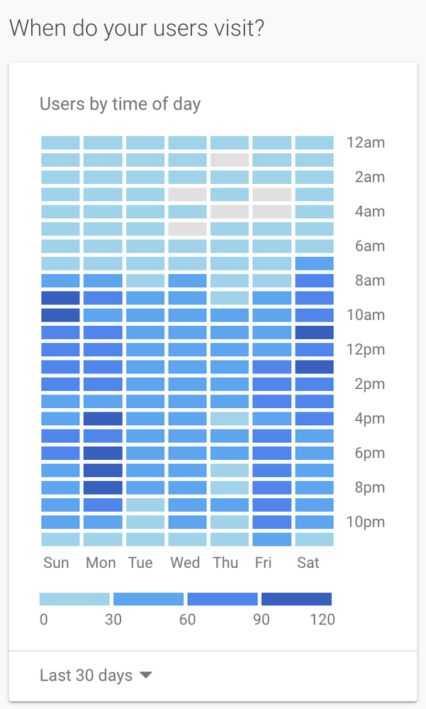
I was wondeing if there was anything like a heatmap app where i can see what time of the day/week is the most popular order times, please see my screenshot for extra clarification (this was taken from google analytics).
Many thanks!
Matt
- Mark as New
- Bookmark
- Subscribe
- Subscribe to RSS Feed
- Permalink
- Report Inappropriate Content
Nov 24, 2020 10:18 AM
Hi John, and welcome to the community!
No, not a native feature in Airtable, but there are ways to build these.
The new Vega-Lite block is able to display horizontal bar charts set to 100% scale which causes every bar to be the same hight. By plotting the data this way, you can simulate a heatmap.
You can also build these in a Script Block using a grid display. And lastly, a Custom App is able to render pretty much any kind of display from Airtable data.
- Mark as New
- Bookmark
- Subscribe
- Subscribe to RSS Feed
- Permalink
- Report Inappropriate Content
Nov 30, 2020 04:32 PM
Thanks Bill! i will take a look.

