- Mark as New
- Bookmark
- Subscribe
- Subscribe to RSS Feed
- Permalink
- Report Inappropriate Content
May 05, 2021 07:47 AM
Dear all,
I am new to Airtable and am trying to recreate a simple design I had in google sheets. In short, I have in one table:
- Days of the week as rows
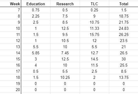
- And for each day/row a column with time spend per part of my job (e.g., research, education, management); i.e., three columns.
Like this:
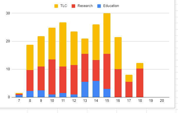
Now I would like to create a stacked barplot of these three columns. Like this:
However, all documentation for both the chart-app and vega-lite app I read so far seem to assume that there is a separate grouping variable, rather than multiple columns being stacked. Is there any way to make this work?
Hope it’s clear, thanks in advance!
 all the best,

Frank- Mark as New
- Bookmark
- Subscribe
- Subscribe to RSS Feed
- Permalink
- Report Inappropriate Content
May 05, 2021 08:42 PM
Also looking for a solution for this
It’s such a simple application, I feel like I must be missing something obvious
- Mark as New
- Bookmark
- Subscribe
- Subscribe to RSS Feed
- Permalink
- Report Inappropriate Content
May 06, 2021 12:32 PM
I’m having the exact same problem - even in Vega-Lite it seems difficult to achieve.
- Mark as New
- Bookmark
- Subscribe
- Subscribe to RSS Feed
- Permalink
- Report Inappropriate Content
Dec 21, 2022 01:45 AM
I'm having the same problem
- Mark as New
- Bookmark
- Subscribe
- Subscribe to RSS Feed
- Permalink
- Report Inappropriate Content
Feb 21, 2023 10:07 AM
same problem! please somebody answer!
- Mark as New
- Bookmark
- Subscribe
- Subscribe to RSS Feed
- Permalink
- Report Inappropriate Content
Apr 19, 2023 02:47 PM
I also have the exact same problem


