

Dear all,
I am new to Airtable and am trying to recreate a simple design I had in google sheets. In short, I have in one table:
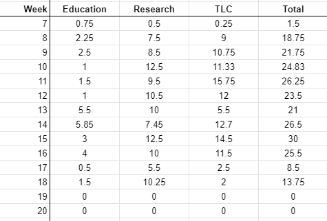
- Days of the week as rows
- And for each day/row a column with time spend per part of my job (e.g., research, education, management); i.e., three columns.
Like this:
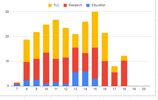
Now I would like to create a stacked barplot of these three columns. Like this:
However, all documentation for both the chart-app and vega-lite app I read so far seem to assume that there is a separate grouping variable, rather than multiple columns being stacked. Is there any way to make this work?
Hope it’s clear, thanks in advance!
 all the best,

         Frank

