itoldusoandso

10 - Mercury
Comment Post Options
- Subscribe to RSS Feed
- Mark as New
- Mark as Read
- Bookmark
- Subscribe
- Printer Friendly Page
- Report Inappropriate Content
Dec 31, 2021
10:26 PM
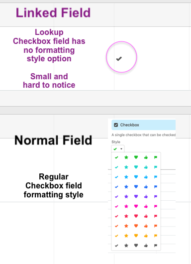
This is a small styling suggestion to prettify the linked field pointing to a checkbox field in another table. The linked field has no styling option and all it shows is a tiny easy to overlook and boring grey check-mark. Could use some more style options similar to the actual checkbox field.
See more ideas labeled with:


