Turn on suggestions
Auto-suggest helps you quickly narrow down your search results by suggesting possible matches as you type.
Showing results for
This Product Ideas board is currently undergoing updates, but please continue to submit your ideas.
- Airtable Community
- Product Ideas
- Calendar View Visible Hours (Height) Customization
Idea Options
- Subscribe to RSS Feed
- Mark as New
- Mark as Read
- Bookmark
- Subscribe
- Printer Friendly Page
- Report Inappropriate Content
Calendar View Visible Hours (Height) Customization
Turn on suggestions
Auto-suggest helps you quickly narrow down your search results by suggesting possible matches as you type.
Showing results for
Jessica_Stroede

4 - Data Explorer
Comment Post Options
- Subscribe to RSS Feed
- Mark as New
- Mark as Read
- Bookmark
- Subscribe
- Printer Friendly Page
- Report Inappropriate Content
Sep 21, 2021
12:27 PM
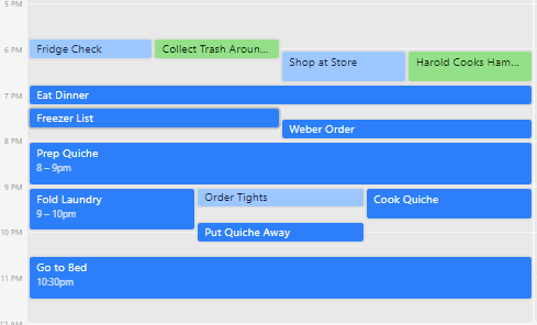
Using Airtable to plan out my day. I like this better than using Google Calendar or iCal since I can see the items as both a list and on a calendar. I can also have way more colors and categories without getting too complicated. Issue is that many of the items are 15 minute tasks and it’s hard to visualize when the tasks push each other to the side instead of stacking. I’d suggest that calendar view be customizable so the height shows X hours at a time. Then scroll can be used to see all the items within a day and no item needs to be pushed to the side because there isn’t enough height for the name of the item.
See more ideas labeled with:
2 Comments
Idea Statuses
- New Ideas 789
- Already in product 11
- Considering 0
- In development 0
- Not on the roadmap 2
- Launched 26

