Help

This Product Ideas board is currently undergoing updates, but please continue to submit your ideas.

Charts displaying data from multiple Tables

cancel
Showing results for 
Search instead for 
Did you mean: 
Russell_Bishop1
8 - Airtable Astronomer

I am often in a position where I would like to compare data from two tables.

Say for example, one table was my Estimations table, where I have many entries where I forecasted the result of something.

In a separate table, I have my Records, where I recorded the results of entries.

If I wanted to map those those table together, there is no way to do so. The only solution is to merge those two tables into one single table.

This would be fine if the data was used in exactly the same way (all of it’s subsequent columns were doing the same things to the data), or the columns were simple, but this is not the case. I calculate different things on my Estimates than my Results.

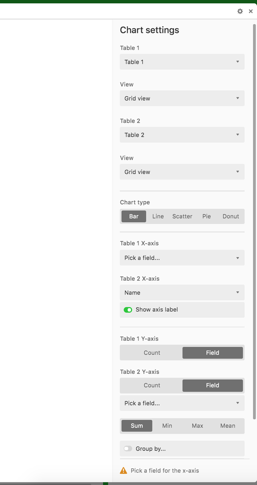
The solution for this would be permitting Multi-Table Charts, where I select:

Screen Shot 2020-01-11 at 23.05.29

Table 1
X, Y, Grouping

Table 2
X, Y, Grouping

Or alternatively…

X Value
Table 1: COL, Table 2: COL

Y Value
Table 1: COL, Table 2: COL

Grouping

This would allow for much more powerful data comparison, and would not require me to try to merge different data into one table for the sake of charting-only.
7 Comments
Bill_French
17 - Neptune
17 - Neptune

Actually, this is untrue. You can simulate the idea that both tables are joined [virtually] by using the API and a middle-tier of some type – all possible today.

Correct, and this is at the core of the business requirement - you (and perhaps many others, I +1’nd it) need to be able to merge the data virtually (by reference), preferably not physically (by value) – the latter being inefficient, latent, and complex.

The better approach (and I think you are essentially saying this) is to create data visualizations based on interpretations of existing table states. This typically requires the ability to perform multi-pass processes to make the appropriate decision-tree and blending logic to extract the metrics you need. Indeed, you simply want to shape your data to be viz-ready and then render these interpretations.

You are suggesting that the builders of a simple and elegant database product also dive in to support analytical processing, the outcomes of which require very broad capabilities for nearly every imaginable data manipulation process. It’s one thing to use Airtable to create a chart from a single table; it’s very different to build unified analytics that require complex process logic. Perhaps Airtable is heading in this direction, but I suspect they aren’t. This is a very heavy lift for any low-end database app provider to undertake.

Idea…

Consider using the Airtable (API) + Streamlit + Python to assimilate and process your data science needs. This is not a pathway for everyone, but you’ll be surprised how powerful this approach is once you get a few simple analytics running.

Russell_Bishop1
8 - Airtable Astronomer

Hi @Bill.French – sounds like you understand what I am trying to achieve, but I’m not sure on your description of the complexity.

The better approach (and I think you are essentially saying this) is to create data visualizations based on interpretations of existing table states. This typically requires the ability to perform multi-pass processes to make the appropriate decision-tree and blending logic to extract the metrics you need.

I’m not sure I understand your point here - if the user narrows down the data into something that could be shown in one Chart if it were already in the same table - is this so developmentally difficult? What am I missing?

In both cases you are providing an X and Y to be plotted, say, a Number and a Date.

You are suggesting that the builders of a simple and elegant database product also dive in to support analytical processing, the outcomes of which require very broad capabilities for nearly every imaginable data manipulation process.

Again - not sure I understand the added complexity here. I’m not looking for more complex charts, just multiple tables’ data (in the same format) shown in one Chart.

Consider using the Airtable (API) + Streamlit + Python to assimilate and process your data science needs. This is not a pathway for everyone, but you’ll be surprised how powerful this approach is once you get a few simple analytics running.

I appreciate your suggestion - but this is a far cry from the cloud-hosted WYSIWYG solution that I am making a Product Suggestion for.

Bill_French
17 - Neptune
17 - Neptune

Okay - I may have misunderstood the sameness of the tables - so, you should be able to use a rollup, right? And then plot the chart from that aggregation?

Russell_Bishop1
8 - Airtable Astronomer

Charts are created using a single-row-per-plot in the chart.

A rollup creates a single value, in a single row, from many values in many rows that exist in a different table. That would not help me plot a chart, but it would help make data visible in another table.

My request is that two tables with columns of the same type could be plotted together, in the same way that they could if they were in the same table, but using a Single-Select to separate them by a Type.

Bill_French
17 - Neptune
17 - Neptune

I was thinking of a rollup that did not merge the records - simply a way to effectuate a merge for charting purposes.

Russell_Bishop1
8 - Airtable Astronomer

Ah you mean keeping an array. But I don’t think that would be sufficient to plot a Chart.

Russell_Bishop1
8 - Airtable Astronomer

Uploaded an image to demonstrate ^