LW-SavvyIndie

6 - Interface Innovator
Comment Post Options
- Subscribe to RSS Feed
- Mark as New
- Mark as Read
- Bookmark
- Subscribe
- Printer Friendly Page
- Report Inappropriate Content
May 20, 2021
08:56 AM
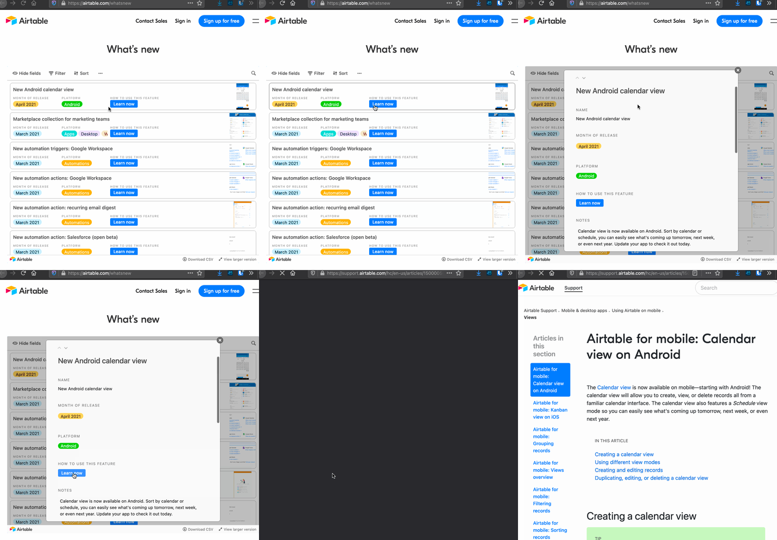
Even on AirTable’s own “Whats New” product update page, they use a Grid View embed they’ve set to Card Layout on Desktop.
But it’s fundamentally bad UX:
Buttons open the card like anywhere else rather than the link itself!
The point of a button is it goes somewhere different!!
See more ideas labeled with:
1 Comment


