- Subscribe to RSS Feed
- Mark as New
- Mark as Read
- Bookmark
- Subscribe
- Printer Friendly Page
- Report Inappropriate Content
We really want to use Airtable as a user-facing intake form, rather than spreading our system across Airtable, Google Forms, and whatever else.
In Airtable’s current state, we’d have to compromise on a more frustrating user experience, which we assume will lower form completion.
I don’t think the Form view has to be visually consistent with the Grid view, and I believe that keeping it this way is a disservice to end users.
Some examples:
Single or Multi-Select
Google Forms shows you all possible answers. I can’t post more than one image here apparently, but it basically lists out all the options, lets you quickly select an option and move on.
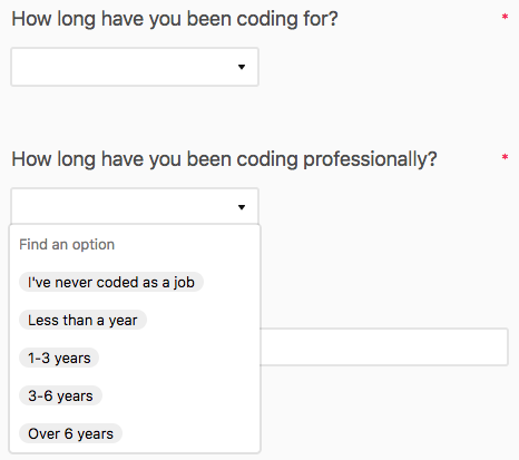
In contrast, this is Airtable:
Airtable’s visual design is great, but in terms of usability, it hides the options and requires 4 clicks and spread out cognitive load where the other requires only 2.
Worse, if I’m using multiple select—which are simple checkboxes in Google Forms—a user will only see a button that says “Select an option.” (again, I can’t include more images unfortunately)
- They don’t see the available options
- They have to re-click “Select an option” ever time they want to select a new one, which can get repetitive and frustrating if there are a lot of options.
- Their selections will then appear as inline tokens (potentially spread across multiple rows), which makes answers hard to parse and keep track of.
Checkboxes
If my only answers are Yes or No, I would ideally like to use a binary option, but in Airtable, it’s just a question followed by a floating checkbox.
If this simply had the options to include a “Yes” next to the checkbox, it would really help clarify what’s happening here.
The current design means we’ll have to limit the amount of questions we ask to offset the increased fatigue, and that’s a shame.
We’d really love it if Airtable tweaked its form design slightly to match how people actually fill out forms.
Thanks so much!

