- Subscribe to RSS Feed
- Mark as New
- Mark as Read
- Bookmark
- Subscribe
- Printer Friendly Page
- Report Inappropriate Content
We work a lot with MP3 files in our Airtable bases.
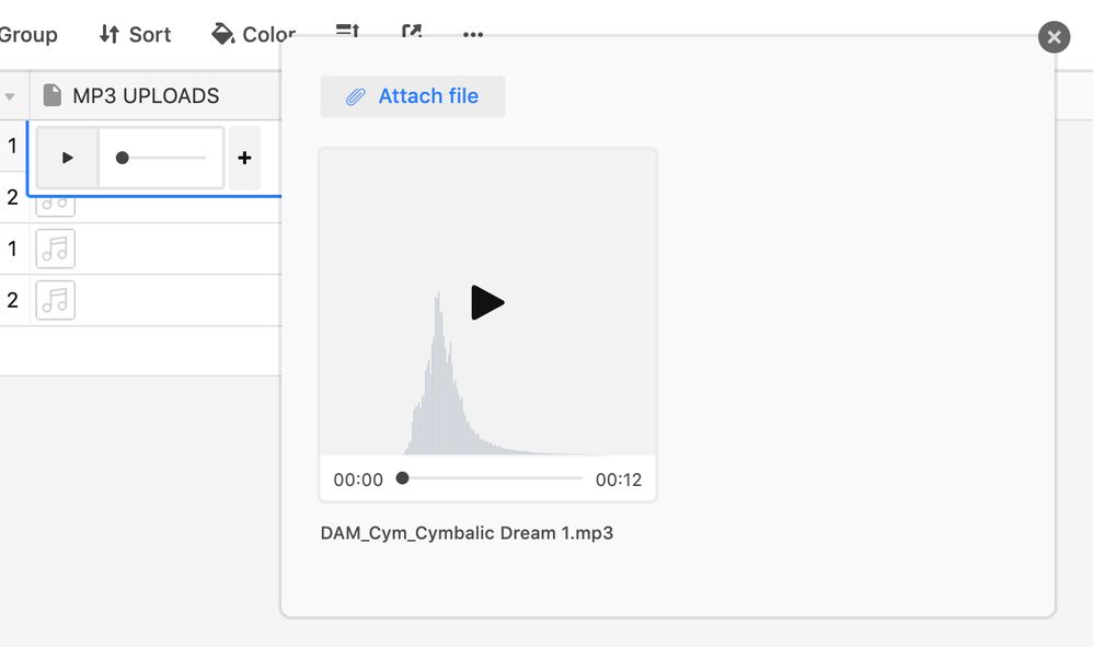
When playing back an MP3 file in an expanded record view window, all we currently see is a gray square with a play icon in the middle.
It would be fantastic to also see a basic representation of the file’s waveform (like in Dropbox). That way we can see what we hear. It would allow us to jump to a section in the file based on its waveform. The waveform would have to be placed exactly between the left and the right time indicators, so that the little black playback dot and the waveform line up correctly.
Everyone working with audio files is used to working like this. This feature would make Airtable attractive to a whole new group of professional users.
Here’s a mockup of what this expanded waveform view could look like:


