Turn on suggestions
Auto-suggest helps you quickly narrow down your search results by suggesting possible matches as you type.
Showing results for
This Product Ideas board is currently undergoing updates, but please continue to submit your ideas.
- Airtable Community
- Product Ideas
- Shorter Width for Form Submission Messages and an ...
Idea Options
- Subscribe to RSS Feed
- Mark as New
- Mark as Read
- Bookmark
- Subscribe
- Printer Friendly Page
- Report Inappropriate Content
Shorter Width for Form Submission Messages and an Easier Way to Preview
Turn on suggestions
Auto-suggest helps you quickly narrow down your search results by suggesting possible matches as you type.
Showing results for
Celeste_Bancos

7 - App Architect
Comment Post Options
- Subscribe to RSS Feed
- Mark as New
- Mark as Read
- Bookmark
- Subscribe
- Printer Friendly Page
- Report Inappropriate Content
Jan 21, 2024
03:44 PM
Status:
New Ideas
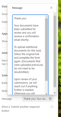
I am creating an Interface Form and I have a long submission message. The text does not wrap until it hits the edge of the page, which looks bad and is hard to read on a wide screen. Ideally it would automatically wrap at a reasonable reading width with nice justified text.
As a workaround, I added line breaks. But this required a lot of back-and-forth to get it to look good and it was annoying that I had to submit my form every time I wanted to test a change. A quicker way to preview the submission message would be very convenient.
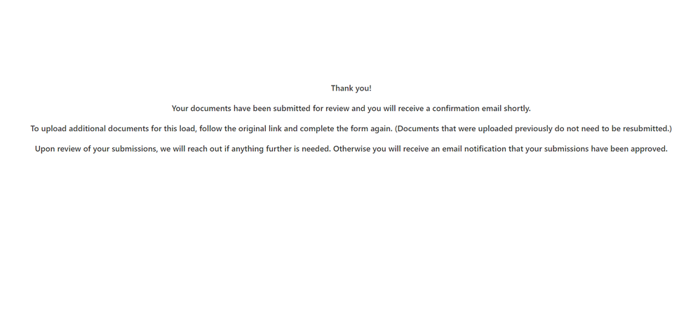
Here's what I ended up with. Not the prettiest but it'll do.
See more ideas labeled with:
Idea Statuses
- New Ideas 787
- Already in product 11
- Considering 0
- In development 0
- Not on the roadmap 2
- Launched 26


