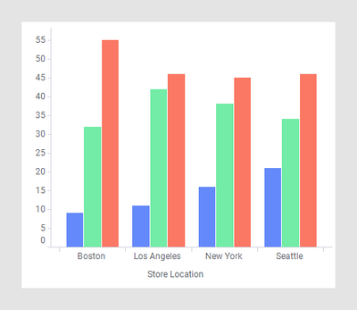
2. Another way is to use Make’s advanced automations & integrations for Airtable to automatically generate your bar charts by sending your Airtable data from Airtable to any app that supports bar charts with multiple series.
For example, you could automatically send your Airtable data to any of these apps: Google Sheets, Microsoft Excel, Databox, Tableau, Vega Lite, Nocodechart, QuickChart, Looker Studio, Knack, Flourish, Image-Charts, etc.
And then, after automatically generating the cart, you could (1) automatically embed that chart into an attachment field in Airtable, or you could (2) automatically add the direct links to the charts in URL fields in Airtable.
I 100% agree since the default is a stacked bar chart.
I've gotten around this by creating a third column that combines the data of two different fields and labeling it "for bar charts only" to show the YoY comparison of revenue per month.
Not ideal but it works for my use case because I only need to compare two different points. Here's how I hacked it: