- Subscribe to RSS Feed
- Mark as New
- Mark as Read
- Bookmark
- Subscribe
- Printer Friendly Page
- Report Inappropriate Content
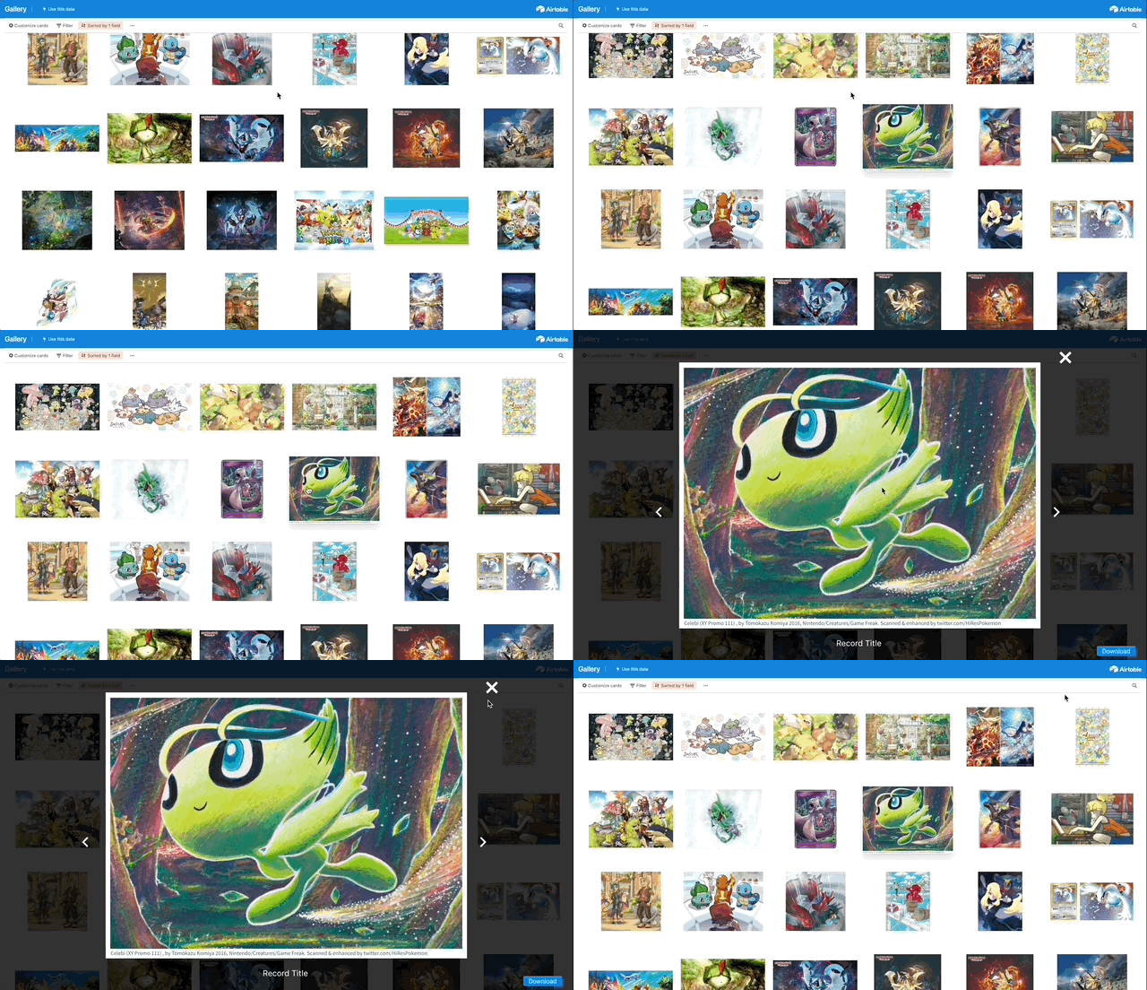
I want to be able to show off the photos of my records. There’s too many interface elements. I just want to browse through the photos and click on a record to view the image nice and large.
Prototype
Design suggestions:
- gallery should not have any labels, just the first attachment
- should be simple to arrow left/right between records
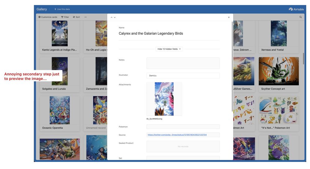
- record information should be hidden away (maybe behind some click that shows more info)
Nice to have:
- a slider near search to control the number of columns (and thus the gallery image size)
- masonry layout
- dark theme
Current design notes:
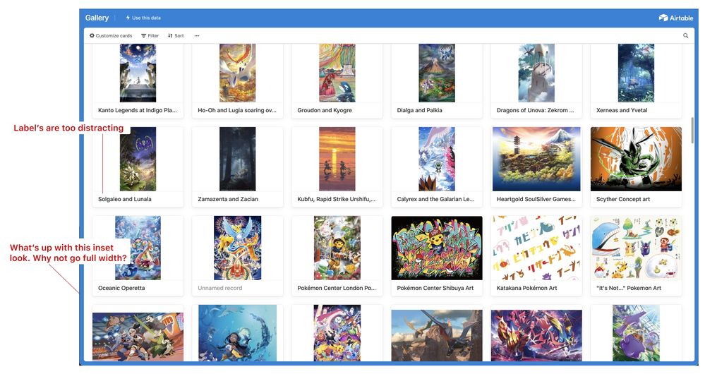
Things are too cluttered & distracting due to lots of labels and lines. Also what’s up the claustrophobic inset style? Make the scroll area full width to let the images be the show.
I don’t really care about the record information at this point. I want to preview my image fullscreen!
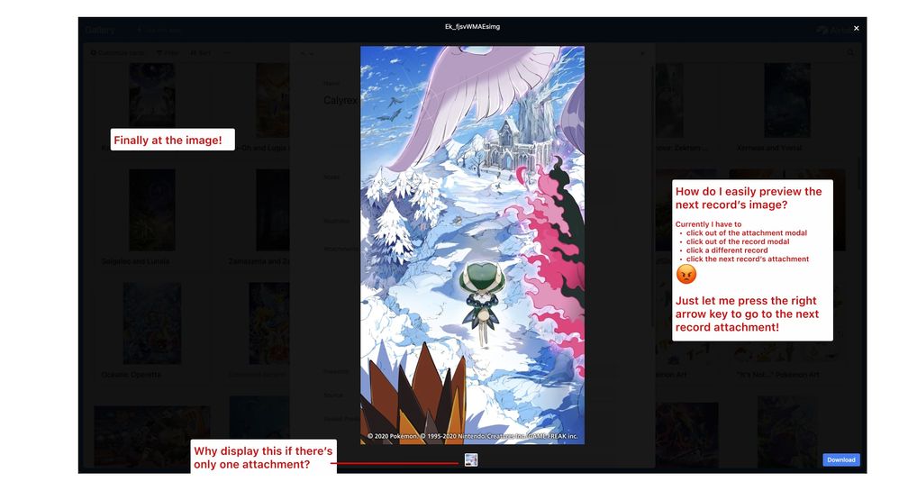
Finally at the image! Nice. How do I get to the next one? Click out of two modals, click another image from the gallery, click the record’s attachment… so many clicks when I just want to press the right arrow key to go to the next record’s attachment.


