Help

This Product Ideas board is currently undergoing updates, but please continue to submit your ideas.

Table/Tab selection update needs work IMHO

cancel
Showing results for 
Search instead for 
Did you mean: 
DamonH
6 - Interface Innovator

Hello All, Hello Airtable.

You have changed my life! You have allowed a small team that handles $20-100m in grant funds each year composed of 80-120 major projects to come out of the dark ages (excel and MS Access) and increase efficiency, decrease errors, and significantly increase job satisfaction and sustainable work stress. Everyone who uses it is happy, as are our trustees and decision makers. A state agency making this kind of change/improvement in such a short time (since Dec 2020) is a minor miracle. Thank you.

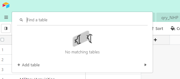
But this morning I am dismayed to see a reversal of progress, in my opinion, in a very basic function: The table selector behavior. its now a search, instead of a select. Doh!

Capture

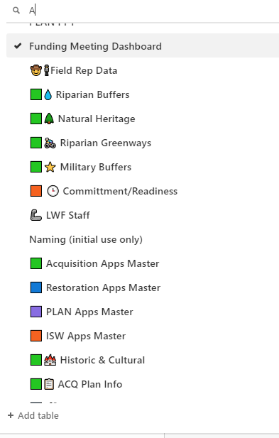
I spent A LOT of time color coding , arranging and training to be able to get the entire team working within our 49 tables (each member uses maybe 4-6, but they all need to be there, with the first 15 being the most used). I cant get the table list to pull back up so here is a screenshot with just searching for “A”. As the developer, I cannot always recall what every table is called. I really need to have a way to view all tables in order and select from there. This is super critical basic behavior that existed yesterday, but not today.

Capture2

Search function? Awesome! But maybe have that as a top row ‘narrowing’ option (like the rest of Airtable does) instead of opening a blank box? Logic has it that most of us will have our main/most used tables in the first 3-6 tables, so why not show us those anyway? Instead of that fun/demoralizing sideways empty table. Poor thing… haha.

Don’t get me wrong, I am happy to have new stuff rolling out. Gantt charts in views and calendaring, for example, are recent updates that have made a huge difference to us. As were View bins and favoriting.

(related topic: Tabs now DO follow your click/selection, and the highlighted table appears at the top left when you are there. This was a previously submitted bug from me and appears to be fixed. YAY and thank you!! :clap: :clap: )

Capture3

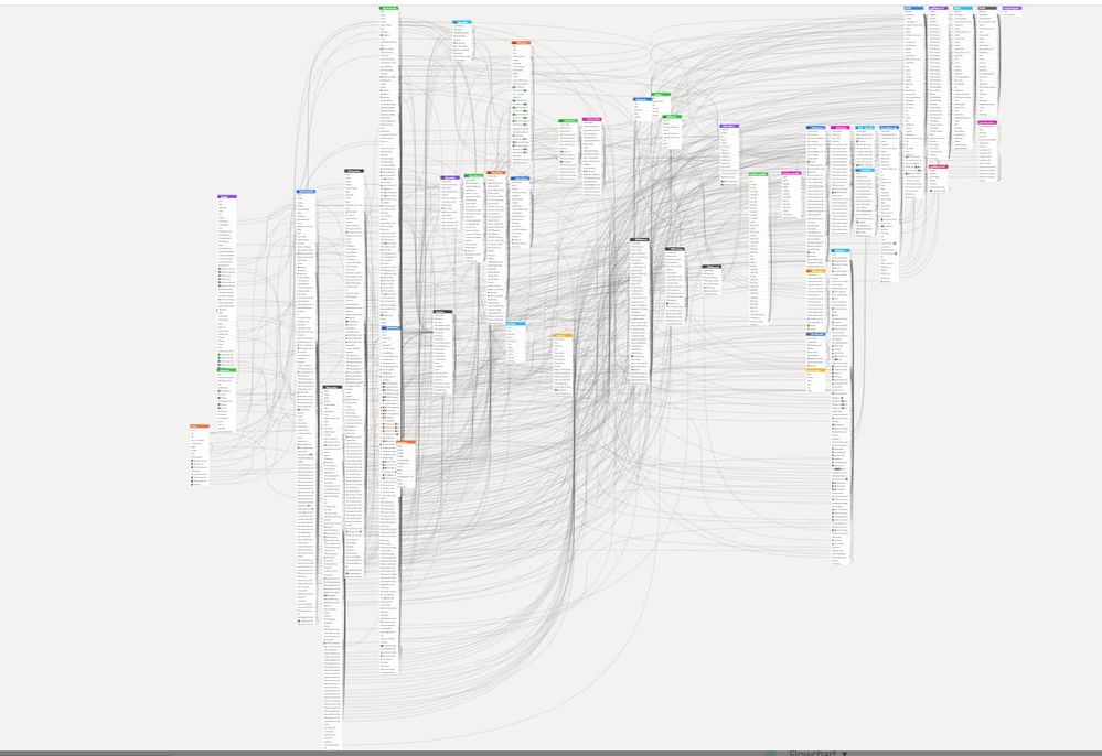
And lastly, a shot of our base schema which is either a humble brag or a very nervous laugh/realization of how this monster has grown:

Capture4.PNG

Thanks!!

Damon

17 Comments
kuovonne
18 - Pluto
18 - Pluto

Thank you for sharing the latest UX/UI changes that Airtable is testing. I agree that this design is not working. In the past when enough of the community has chimed in on design changes as disruptive as this one, Airtable has made changes (sometimes very quickly, sometimes over the course of weeks or longer).

Jen_Rudd
7 - App Architect
7 - App Architect

I totally agree that the dropping in random UX/UI changes disrupts teams working on a daily basis. Most software companies let you “opt in” to be the guinea pig, instead of just foisting it on you.

And PS, that schema is AWESOME. So glad to see you digging in @DamonH!

Martin_Kopischk
7 - App Architect
7 - App Architect

I don’t normally complain about changes here, but in this case, I totally agree; our table list, while not quite as intricate as @DamonH’s, is still large enough not to be visible in its entirety on all but the largest screens. Until this change, a combination of naming scheme (main tables in CAPS, secondary ones not) and table comments made for a tidy, easily scrollable ToC; that search-only approach is a clear UX regression!

EDIT: filed a bug report with support about this. Fingers crossed.

DamonH
6 - Interface Innovator

UPDATE: Carly with Airtable Support responded that it looks like a bug, and they have engineers working on it. A bug would be a much better answer than a planned change… thanks all for your thoughts above. We shall see!

Martin_Kopischk
7 - App Architect
7 - App Architect

Support also have acknowledged the issue I filed and are “actively looking into it”.

Martin_Kopischk
7 - App Architect
7 - App Architect

Hah, crossing of the streams. Now we either get a resolution, or the Airtable universe will end.

Databaser
12 - Earth
12 - Earth

Wow, so glad this is a bug and not an intented change :grimacing:

Martin_Kopischk
7 - App Architect
7 - App Architect

Just a heads up: Airtable Support have confirmed Engineering are working on the issue and are expecting an update with a fix for the issue “soon”.

kuovonne
18 - Pluto
18 - Pluto

I think that the new feature being tested is the +Add table > at the bottom. I was so distraught at the disappearance of my list of tables, that I didn’t give much thought to these buttons. Are they new or are did I just never notice them before?

image

DamonH
6 - Interface Innovator

I followed up with Airtable Support. They just replied that it should be fixed within the next day…