Nimesh

5 - Automation Enthusiast
Comment Post Options
- Subscribe to RSS Feed
- Mark as New
- Mark as Read
- Bookmark
- Subscribe
- Printer Friendly Page
- Report Inappropriate Content
Feb 23, 2020
10:42 AM
Hello,
I love Airtable and can’t be thankful enough for the amazing product.
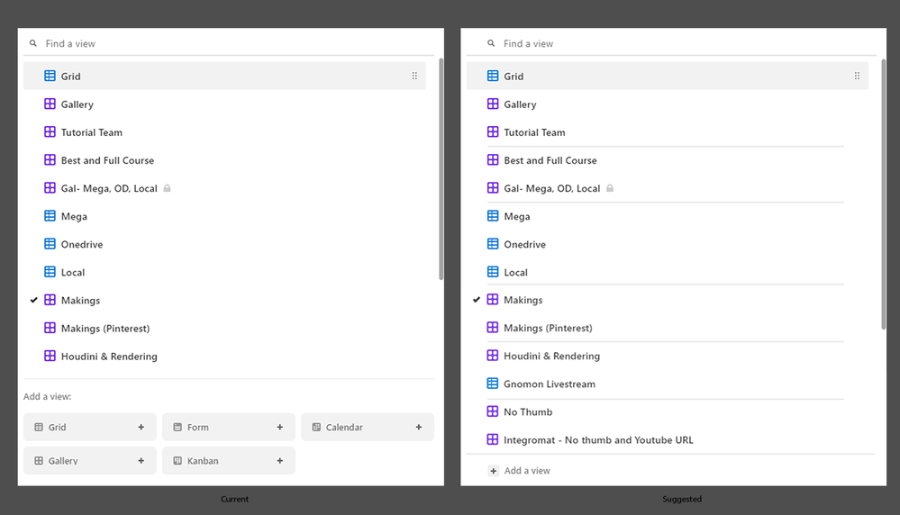
However, I would be happy if some of the things were implemented. It feels very unorganized when you have multiple views.
- First, I think separator or some sort of grouping would make it much cleaner and easier to understand.
- Secondly, I think “Add a view” section is too big. It feels like it’s aimed for new users but it always draws me to create a new view even if I don’t need one. Most of the time we are interacting with pre-existing views rather than creating a new view. So, I don’t think it should be getting that much focus. Instead, the focus should be on pre-existing views. Something like this can be done as shown in the attached image. This also gives extra room for additional views. The options pops up when we click “Add a new view” button. The new users should easily get hang of it within the few minutes of using airtable.
- Third, it’s a minor thing but may be the search icon should align with the icons of the views.
Thank you.
See more ideas labeled with:
2 Comments

