Olpy_Acaflo

9 - Sun
Comment Post Options
- Subscribe to RSS Feed
- Mark as New
- Mark as Read
- Bookmark
- Subscribe
- Printer Friendly Page
- Report Inappropriate Content
Aug 31, 2021
09:26 PM
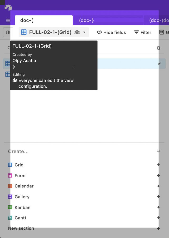
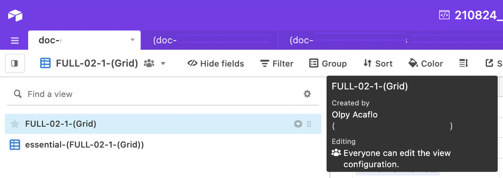
VIEWS Selector UI Comp: PERMISSIONS position of the tooltip text isn’t always very good:
Just Take a look at screens:
BAD: tooltip position at VIEWS Selector UI Comp first render:
GOOD: tooltip position after Mouse right hover:
When you access VIEWs Selector often, it’s one more gesture you have to learn to simply see your views.
Is there some way for User to deActivate these Tooltips ?
I would prefer Airtable would fix first Tooltip position when appearing to UI.
Best regards,
oLπ
Recorded on MACbook M1, OS Big Sur, CHROME ver.92 (arm64) autoUpdated.
See more ideas labeled with:


