- Mark as New
- Bookmark
- Subscribe
- Subscribe to RSS Feed
- Permalink
- Report Inappropriate Content
May 14, 2018 08:21 PM
The sheer amount of whitespace in Airtable has always bugged me a little, so I’ve been making little edits to the stylesheet here and there to get more data on-screen. Below you’ll find some screenshots of what I’ve done and the code required to make it look that ugly.
You can use something like the Stylus extension/plug-in to apply the CSS to Airtable.
Note: I’ve come up with this code mostly through trial and error, so use at your own risk. (Let me know if something breaks spectacularly and I’ll try to help, but there’s a possibility I won’t be able to figure out what’s going on on your end.) Also, the actual structure of the HTML is changing all the time, so don’t be surprised if the code stops working suddenly.
EDIT: fixed code line-wrapping
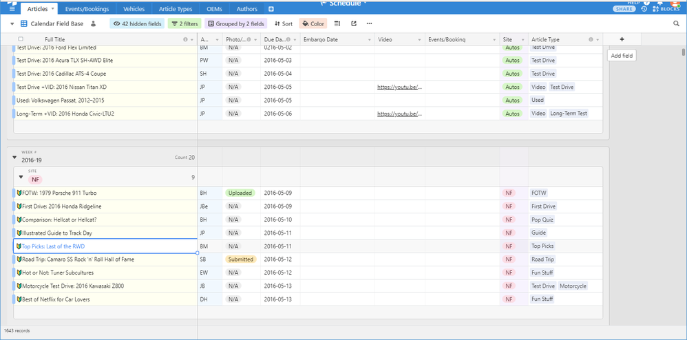
In this first example, I’ve removed the row number and expand record button from the grid view – I’ve always found them superfluous.
(There’s also a header hack that reduces the vertical space quite a lot and smushes everything together which I didn’t include.)
/*****
* Row Header Cleanup
*  Removes the row number, expand record button, and associated whitespace
*****/
.dataRow .rowNumber {
    display: none !important;
}
.dataRow .expandButtonLeft {
    display: none !important;
}
.dataRow .staticCellContainer {
    width: 0px !important;
}
.dataRow .cell.primary {
    margin-left: 0px !important;
    width: calc(100%) !important;
}

/* The below code fixes the column width in groups*/
.gridViewGroup.groupLevel3 ~ .dataRow .cell.primary {
    margin-left: 0px !important;
    width: calc(100% - 47px) !important;
}
.gridViewGroup.groupLevel2 ~ .dataRow .cell.primary {
    margin-left: 0px !important;
    width: calc(100% - 31px) !important;
}
.gridViewGroup.groupLevel1 ~ .dataRow .cell.primary {
    margin-left: 0px !important;
    width: calc(100% - 15px) !important;
}

/*****
* Column Label Icon Removal
*  Removes the label icon and resizes the label to take up the full space
*****/
.nameAndDescription svg {
    display: none !important;
}
.nameAndDescription .name {
    left: 8px !important;
    width: calc(100% - 19px) !important;
}
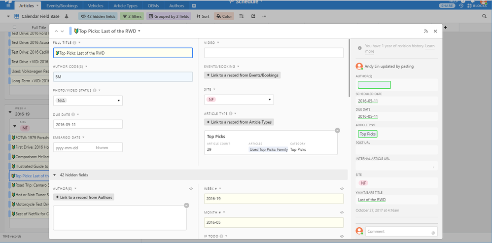
This next one allows the expanded record view to expand to 80% of wider windows and allows multiple columns in the field display.
/*****
* Expanded Records – Whitespace
*  Removes field label icons, darkens the label text,
*  and removes much of the whitespace
*****/
.labelCellPair svg.displayTypeIcon {
    display: none !important;
}
.labelCellPair .fieldLabel {
    color: rgb(3, 3, 3) !important;
}
.labelCellPair {
    margin-bottom: 1em !important;
}

/*****
* Expanded Records – Expand, Multi-Column
*  On wider windows (above 1410px), sets the expanded record view
*  to use 80% of the screen for multiple columns
*****/
@media(min-width:1410px) {
    .detailViewWithActivityFeedBase .dialog {
        width: 80% !important;
    }
    .detailViewWithActivityFeedBaseLeft {
        width: calc(100% - 308px) !important;
    }
    .detailViewWithActivityFeedBaseLeft .body {
        columns: 10 calc(450px + 26px);
        padding: 0px!important;
        column-gap: 12px !important;
        column-rule: 1px dotted #ddd;
    }
    .detailViewWithActivityFeedBaseLeft .hiddenColumnsHeader {
        margin-top: 1em;
        margin-bottom: 1em;
        column-span: all !important;
    }
    .labelCellPair {
        width: calc(100%) !important;
        margin: 0px !important;
        padding: .5em 1em 1em 1em !important;
        -webkit-column-break-inside: avoid !important;
        page-break-inside: avoid !important;
        break-inside: avoid !important;
    }
}
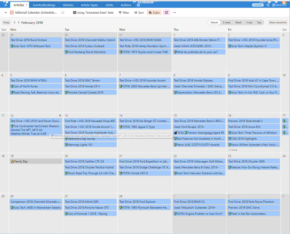
Finally, this code lets calendar entries expand on hover.
/*****
* Calendar Formatting
*  Resize calendar entries to fit article titles on hover
*****/

.calendarRecord:hover {
    height: auto;
    margin-bottom: 1px;
}
.calendarRecord:hover .recordHoverTarget {
    height: 100%;
    min-height: 25px;
    opacity: 1;
    z-index: 100;
}
.calendarRecord:hover .recordHoverTarget > .flex {
    height: auto!important;
    min-height: 24px;
}
.calendarRecord:hover .recordHoverTarget .truncate {
    white-space: normal;
    margin-bottom: 2px;
}
- Mark as New
- Bookmark
- Subscribe
- Subscribe to RSS Feed
- Permalink
- Report Inappropriate Content
May 15, 2018 12:24 AM
awesome hacks! I like the expanded record view.
Maybe you have an Idea to make the “find an existing record” box larger/wider/adjustable.
- Mark as New
- Bookmark
- Subscribe
- Subscribe to RSS Feed
- Permalink
- Report Inappropriate Content
May 15, 2018 01:40 AM
Terrific work! I’d considered looking into this on occasion, but it was one rabbit hole I was frightened of tumbling down. I am so glad you went before me and left a soft bed of pine needles behind in which the rest of us could land!
- Mark as New
- Bookmark
- Subscribe
- Subscribe to RSS Feed
- Permalink
- Report Inappropriate Content
May 15, 2018 06:05 PM
The snag with the record lookup box is that it’s populated via a Javascript function, so while you could hack the CSS to show 7 entries (which is the number that it loads in the window at once) instead of the default of 4.5, you’d need to alter the underlying code to get more information, or to fetch more entries for display.
I’m fine with a bit of code that alters the client/user side of things (one of my other posts demo’d a rudimentary colour-coding setup before Airtable had native support), but I’m a bit wary to touching functions that ping the server.
However, what you can most definitely do is alter the size and arrangement of the entries, but I’m not sure if that is particularly worthwhile without the ability to customize the information you get in those entries.
- Mark as New
- Bookmark
- Subscribe
- Subscribe to RSS Feed
- Permalink
- Report Inappropriate Content
May 15, 2018 06:10 PM
I was actually a bit reluctant to post the code, since I’m not sure where the devs stand on having users alter the front end like this. Obviously, they can’t be expected to offer support for it, and I’ve had to tweak the code to adapt to (unannounced) changes in the HTML structure (their calendar code in particular has been through several iterations and the current one makes a lot of sense for multi-day entries, but completely breaks any code that relies on entries being descendant elements of a particular day).
- Mark as New
- Bookmark
- Subscribe
- Subscribe to RSS Feed
- Permalink
- Report Inappropriate Content
May 21, 2018 05:37 AM
Very nice! Expanded record view could be super helpful…
- Mark as New
- Bookmark
- Subscribe
- Subscribe to RSS Feed
- Permalink
- Report Inappropriate Content
Jan 25, 2019 07:33 AM
Here’s an updated version of the code to reduce the left-side spacing in grouped table views:
/* The below code fixes the column width in groups*/

div.dataRow.leftPane, div.gridViewGroup.leftPane{
    left: 16px !important;
    width: calc(100% - 16px) !important;
}
.groupHeaderCell.groupHeaderLabelCell{
    width: 100% !important;
}

/* Special fix for "ghost" row */
div#dataLeftPane div.dataRow.leftPane.ghost{
    width: calc(100% - 16px) !important;
}
- Mark as New
- Bookmark
- Subscribe
- Subscribe to RSS Feed
- Permalink
- Report Inappropriate Content
May 23, 2019 01:16 PM
@Brenda_Ginsberg asked for simple instructions on using the CSS code presented here.
- Install a user CSS manager. I’m currently using an plug-in/extension called Stylus, which is available for Firefox and Chrome.
- Once it’s installed, click the Stylus icon and click “Manage”.
- In the Installed Styles window, click on “Write new style”.
- In the Add Style window, enter any name you like; then click “Import” under Mozilla Format.
- Copy the contents of this link, paste it into the Paste the Mozilla-format code window, then click “Overwrite style”.
- Click “Save”.
- The CSS should now be active; you may need to refresh the page to see the full effect.
Notes
- The CSS I’ve provided assumes your base is hosted on airtable.com. If the domain is different, you’ll need to change the domain in the “Applies to…” boxes.
- This is a direct copy of my personal stylesheet. It includes a tweak that collapses the top menu bar (since I rarely switch between bases); if you don’t like how it looks, you can disable it by deleting the bit titled “Ugly Top Bar Collapsing” (section “Code 1”, lines 15–28 in).
- Mark as New
- Bookmark
- Subscribe
- Subscribe to RSS Feed
- Permalink
- Report Inappropriate Content
Jul 22, 2019 11:06 AM
Btw, I’ve noticed a bug when using this code in Windows 10 with Chrome (may also occur with other browsers, but I haven’t tried them), when display scaling is set above 100% (for high DPI monitors) due to an issue with reflow.
I’ve tried troubleshooting the bug and the only solution right now is to disable either this code or change display scaling to 100%.
- Mark as New
- Bookmark
- Subscribe
- Subscribe to RSS Feed
- Permalink
- Report Inappropriate Content
Mar 10, 2020 01:14 PM
@Andy_Lin1 is there any way to add custom CSS to a base, without it being a Chrome plugin? I need for the CSS to be applied globally, not just locally. I have an embedded base on an external website. Thanks in advance.


