Help

New: Improvements to Timeline View

cancel
Showing results for 
Search instead for 
Did you mean: 
AlexLama
Airtable Employee
Airtable Employee

Hello everyone, I'm a product designer at Airtable. This quarter, our team is working on a number of improvements to Timeline view based on all the feedback we've heard (much of that from the community so thanks for the great ideas!). 

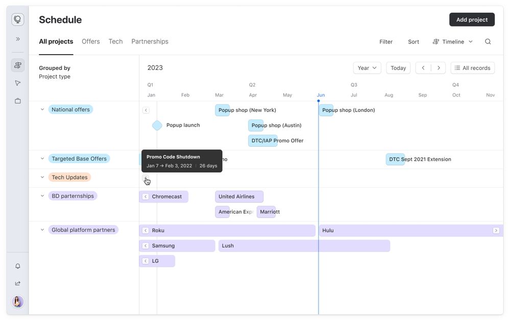
We're starting with improvements to the way we render labels. Previously labels were cut off very often, whenever records were too short or just off the edge of the viewport. This meant reading data required a lot of zooming, scrolling, and hovering.

Today we're making this much easier by releasing three key updates:

  • Labels now stay on the screen as you scroll, so you can continue to read them.
  • Labels overflow, so so they're visible even when the records are very short or zoomed out.
  • Records beyond the fold are now pointed to by arrows, so you can preview and navigate to them.

Frame.jpg

Jump into one of your Timeline views today to try these updates yourself. We hope you enjoy these improvements, but please continue to share your feedback here as well as your ideas on how we can improve our products on the Community Product Ideas board. We look forward to sharing more improvements with you in the coming months.

11 Comments
jonathanlaniado
5 - Automation Enthusiast

These are fantastic updates, great job team!

Stephen_Orr1
10 - Mercury
10 - Mercury

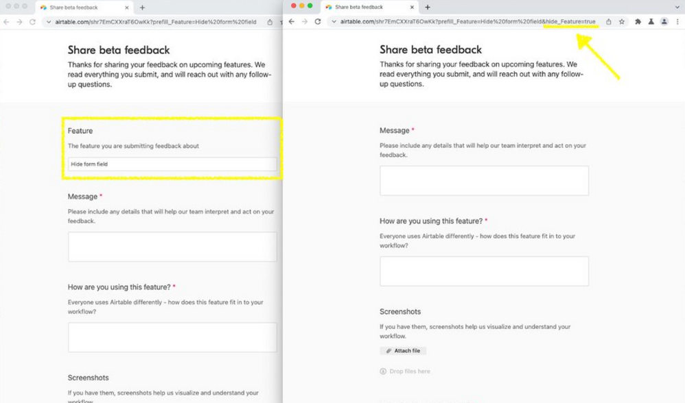
Looks great! Another nice-to-have here would be granular control of which fields are visible in a shared timeline view without impacting the label text (or needing to make all fields visible via the shared view link option.) Love these small but mighty QoL updates!

Carlos-Werq
5 - Automation Enthusiast

@AlexLama Great work! Thank you so much for these improvements. 

Please do Kanban card titles next! 🙂 

Karlstens
11 - Venus
11 - Venus

@AlexLamathanks for sharing.

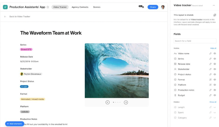
Regarding the mouse-over pop-up dialogue (with the white text and black background), any chance that we could have specific fields shown specifically via this pop-up?

As a very rough mock-up, note in my screenshot below, how showing fields in the Label is kinda pointless, but preferably showing those fields (and more) in the mouse-over pop-up would be useful.

In my example, showing the primary field everywhere also becomes its own issue too - so both the Label and the Pop-up need the ability to show/hide fields, including the Primary field, independent of one another.

TLDR; Can we please have a new button in the Time Line view that allows us to configure the fields shown in the pop-up display?

Karlstens_0-1684988007373.png


Tobias_LGKR
7 - App Architect
7 - App Architect

@AlexLama Thank you. Very helpful.

matt_stewart1
7 - App Architect
7 - App Architect

I like the improvements being made, but @AlexLama  this has greatly disrupted all my timeline views in Safari browser on MacOS. 

My Timeline's use color coding to represent different status, and for some reason the new format is causing most of the text to be barely visible. Its as if the color overlay for the record is on top of the text, so any text and emoji's have a color shift towards the record color.

This is not happening on Google Chrome on MacOS, only Safari.

And even weirder ... it happens on majority of records in Safari, but not all. Some are appearing fine, even if same color as the other problematic records.


BillH
9 - Sun
9 - Sun

@AlexLama Thank  you, this is very helpful.  

The only thing I would add it that it would be helpful to have notification of these changes in advance, and even better an way of accessing a test environment in order to review the impact on existing interfaces and pages.  

AlexLama
Airtable Employee
Airtable Employee

Hi @matt_stewart1, I'm getting the team to look into this issue in Safari, thanks for flagging. 

@Karlstens thanks for this idea, we're starting to look at different kinds of customization we could support through interface designer. Will definitely keep this in mind when we get to working on this. 

katywhiteley
4 - Data Explorer
4 - Data Explorer

It would be nice to be able to toggle this feature, or do as @Stephen_Orr1 suggested and have different field options for the label and the expanded record in the view.

For example, one of my use cases is a schedule of lessons that I teach, which has a button leading to that lesson in my interface. For users to see the button in the expanded view, it must be included in the label. In the label, the button is formatted as its URL, which is very unsightly with the new label overflow feature (see below).

katywhiteley_1-1688960186997.png


AlexLama
Airtable Employee
Airtable Employee

Edit: the options to wrap labels and customize record popovers are both live.

@katywhiteley thanks for your feedback! We're actively working on adding back the option to wrap labels for those cases in which the label content clutters the Timeline. This one is coming soon. 

We're also working on a feature which will allow you to customize the popover independently of the labels shown on the Timeline, so you won't have to show unnecessary labels on the Timeline in the first place!