Help

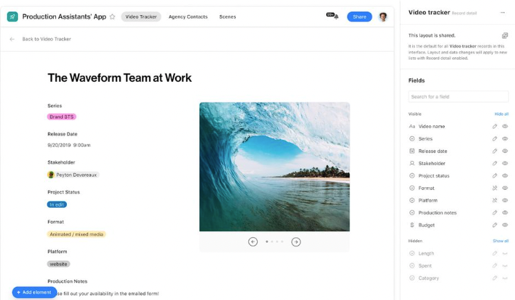
Updates to record details in Interface Designer

cancel
Showing results for 
Search instead for 
Did you mean: 
MicahRoberson
Airtable Employee
Airtable Employee

Hello everyone – Micah here from the product team at Airtable. While we’re super excited to continue updating our layouts in Interface Designer — especially Record Detail — we know that some of our most recent changes have been difficult to navigate. Over the past few weeks, we’ve heard and appreciated all of the feedback that has been shared. Today, we’re excited to release a few updates to help address some of the most critical issues. We’re still hard at work making these layouts even better, and while this release won’t address all of the feedback, we are continuing to listen to all of you and working to improve the overall experience.

Screenshot 2023-10-17 at 9.44.53 AM.png

Updates 

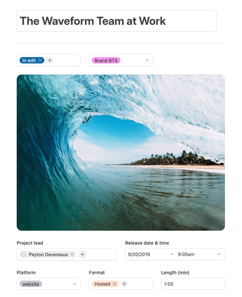
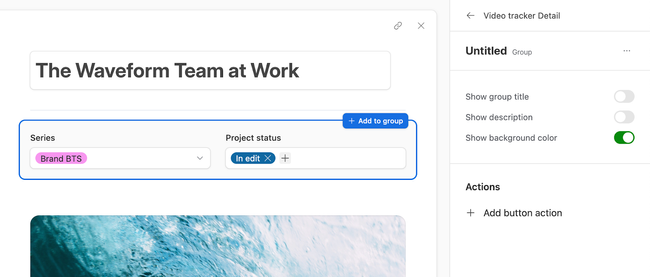
Starting today, you’ll see that “Sections” are now known as “Groups”. We’ve improved the way they work and brought some additional features and functionality to the Record Detail layout:

More options for visual customization and layout flexibility

  • Groups now support an optional background color
  • There’s now only a single, simplified type of Group, and it can support both rows and columns, all configurable via drag-and-drop on the canvas
  • Fields in Groups can be resized to either stretch to fill the available space or pack to fit within a column of the Group
  • Linked record visualizations have an optional toggle to allow linked record visualizations to span the full width of the page when using the full-screen record details layout.

MicahRoberson_1-1697560621487.png


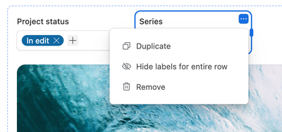
More on-canvas controls. In addition to using the properties panel to build out your layout, we now have more ways to do the following directly from the canvas

  • Add new Groups
  • Add a Title, Description or Buttons to a group
  • Add fields
  • Delete and duplicate fields
  • Hide / show labels for entire rows of fields

MicahRoberson_2-1697560621497.png


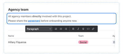
More options for supportive text. Fields now support Helper text and linked record visualizations now support descriptions

MicahRoberson_3-1697560621451.png


Any Record Detail layouts created before the prior launch or which were modified using the “Convert to legacy layout” option will remain unchanged. The “Convert to legacy layout” option will continue to be available as well. 

Thank you again for all of the thoughtful feedback thus far, and please continue to share more via the feedback form. There’s a ton we can build on this surface and we’re excited to continue improving and expanding the possibilities. 


6 Comments
Meredith_Scrog1
6 - Interface Innovator

Thank you for this update and for acknowledging the headaches! It's appreciated seeing that Airtable is making adjustments based on real customer feedback/user experiences. Excited for the next improvements to record detail layouts - hopefully more background colors! 

Karlstens
11 - Venus
11 - Venus

Great progress, and appreciate the sharing of the feedback form. My main request in this domain has been for dynamic background colours, for both Sidesheets, forms and interface bunched elements.

Drew_Nemer
8 - Airtable Astronomer

I love all of these, but here are some bugs:

- the "Show as Full Width" does not make sense, it makes the entire item go beyond the whole page and cuts off on both ends.  I like the idea of expanding certain items, but it should fit within the borders of the page. 


Requests:

- Floating Header (like Legacy Model):  Helps store important details of record always at the top and visible. 

- Custom background colors:  This will allow for easily distinguishing different parts.  Being able to select any color from AirTable's color base would be very helpful.

- Conditional Groups and/or fields that will hide or show dependent on the conditions set by user.  This will be very helpful for interfaces that function as work flows and you want to have different groups be visible dependent on conditions like a single select field that operates as the project's status. This will help keep pages from being too long.  Or let's say show a certain field that acts like warning alert that pops up in specific circumstances. 

- If not conditional groups, collapsable groups.  

- Conditional Buttons, allow buttons to be functional when set to certain conditions or like Conditional groups, visible upon certain cases.

- Graph/visual chart color selection.  Sometimes the preset color schemes for graphs are annoying because I want more control over color schemes and selection.  

- Grid views that are tied to Linked Tables in Expanded records are too long vertically and should have option to adjust to number of records like the List view.

- ability to highlight or put a asterisk next to certain fields in the interface that are missing. This would be good when users use AirTable to send out emails or letters or perform other tasks and they don't know why the automation won't run, and the reason could be because one or more fields are null or incomplete.  Would like the ability to have "Required" fields that would visually indicate if the user attempts to run an action (like pressing a button) but the required fields are null.   Sort of like when adding a new record with the form.


Johari_Wiggins
Airtable Employee
Airtable Employee

@Drew_Nemer thanks for your comment! I'm looking into "Show as Full Width" bug you mentioned. It seems to be working as expected on my end. Do you mind posting a screenshot of the issue?

Drew_Nemer
8 - Airtable Astronomer

NORMAL:

Drew_Nemer_1-1697822714719.png

SHOW AS FULL WIDTH:

Drew_Nemer_0-1697822666413.png


lekin
4 - Data Explorer
4 - Data Explorer

Conditional Groups and/or fields please 😍

Thanks for the amazing work so far. It changed my life.