Help

setting up a shopping cart type system

Solved
Jump to Solution
939 4
cancel
Showing results for 
Search instead for 
Did you mean: 
auekk2787
7 - App Architect
7 - App Architect

Our company has an inventory of office supplies, which we track in a table called 'Inventory'. This has fields for item description, photo, quantity available, location, etc.

We want to create a system to create "checkout orders" and select multiple items, similar to a shopping cart. We want to do this through interface pages.

I know I'll need 2 other tables: 'Orders' (overall requests) and 'Order Items' (items requested in order).

The question is how to create an interactive workflow to place items into your order.

I'd like to have a List or Gallery starting page, which displays all the items in stock. I'd like to do something like a checkbox or button to add items to my order. (I imagine you'll need to create a new order first.)

However, if I just make checkbox field on the 'Inventory' table (the master list), this is seen by all users - which prevents 2 users from "shopping" at once.

Does anyone have a suggestion for making a good experience? I want to avoid jumping between pages: looking at the inventory catalog page, then jumping to their order to link items. I'd like a more seamless process of "click to add to cart".

Thanks!

1 Solution

Accepted Solutions
auekk2787
7 - App Architect
7 - App Architect

I ended up with a similar starting point, but also created a "shop".

I have an order page, where you can add/remove items directly - similar to your demo.

auekk2787_0-1723476340465.png

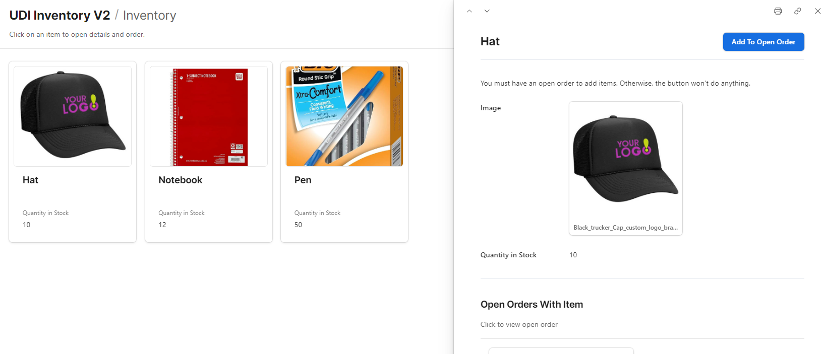
But then I also created a gallery of the inventory, and the item detail has a button to add it to an open order. This is based off an automation that searches for open orders for the user. It then shows which orders the item appears in.

auekk2787_1-1723476377086.png


See Solution in Thread

4 Replies 4

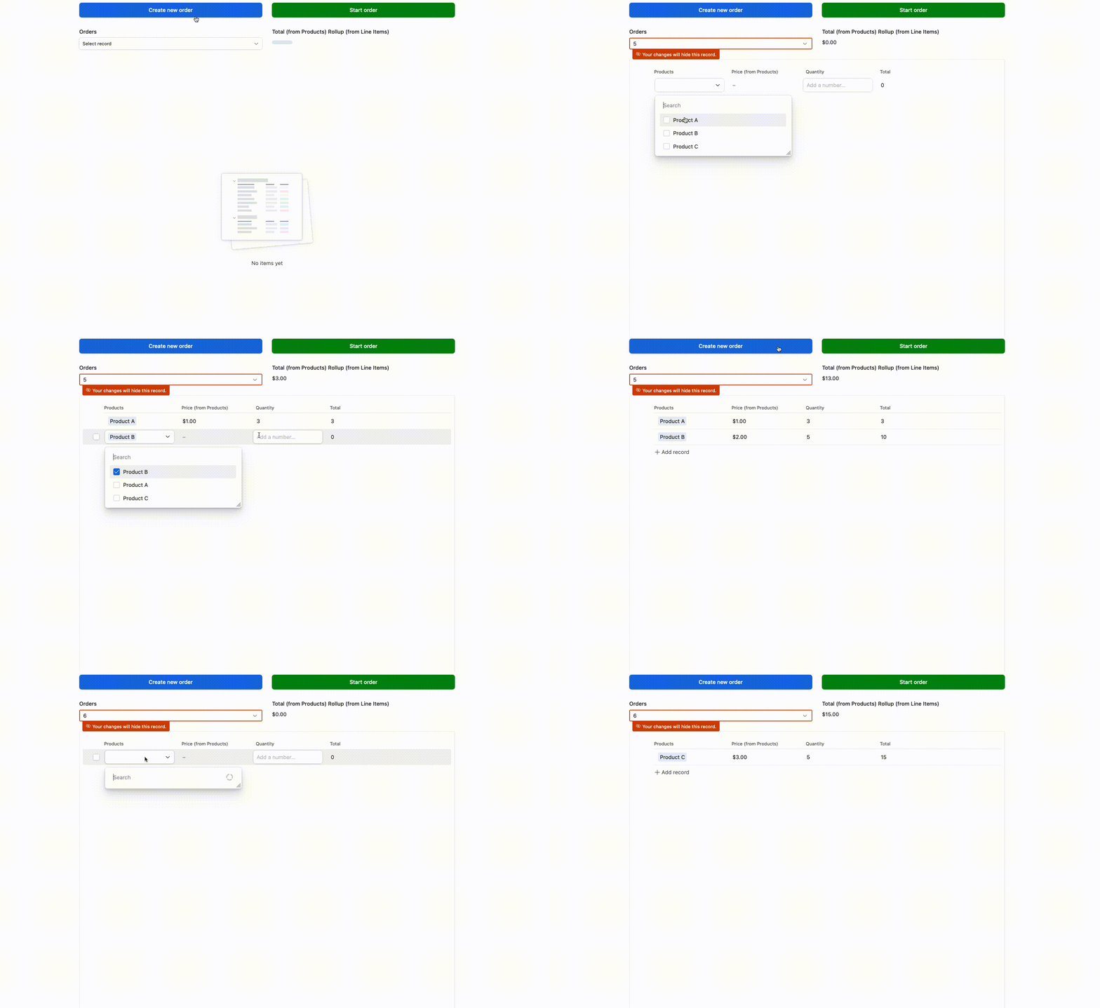
How does this look?

Screen Recording 2024-08-10 at 9.48.22 AM.gif

Link to base
---
The biggest issue here is good UX for how to create a new Order.  I tried to make it smoother and so the workflow is:
1. Click "Create new order" - This applies a record template that creates a new Order record (Could use an automation for this instead)
2. Click "Start order" - This moves the user to the next Order record that has no Line Items in it, and that's why that filter thing shows up

I like this because it's all in one page.  I don't like the extra click and filter warning though, but figured I'd just let you have a look at it heh

The other thing I was toying with was having an "Orders" page on its own, and the user would create a new Order there.  After they did that they'd have a button to click that would lead them to the same page as the gif

auekk2787
7 - App Architect
7 - App Architect

I ended up with a similar starting point, but also created a "shop".

I have an order page, where you can add/remove items directly - similar to your demo.

auekk2787_0-1723476340465.png

But then I also created a gallery of the inventory, and the item detail has a button to add it to an open order. This is based off an automation that searches for open orders for the user. It then shows which orders the item appears in.

auekk2787_1-1723476377086.png


I'm looking to do a very similar thing. Anything else you'd be willing to share, like a gif of the workflow, or perhaps the automation? 

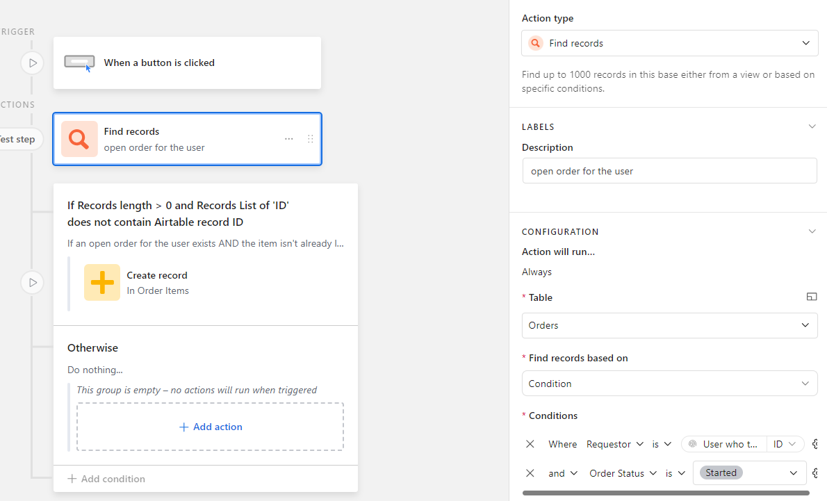
This is the automation.

First I find the open order for the user (Requestor = current user).

auekk2787_0-1727714760093.png

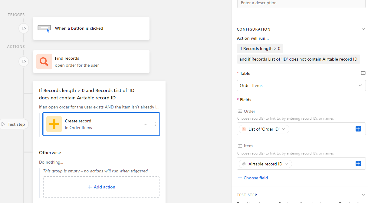
If the order is found (meaning, they should have created an open request first), then link the requested item to the order. This is a join table called "Order Items" that combines the Requests table and the generic Inventory table (which displays my gallery).

auekk2787_1-1727714811388.png