- Airtable Community
- Discussions
- Ask A Question
- Interface Designer
- Re: How to create a graph showing growth over time...
- Subscribe to RSS Feed
- Mark Topic as New
- Mark Topic as Read
- Float this Topic for Current User
- Bookmark
- Subscribe
- Mute
- Printer Friendly Page
Re: How to create a graph showing growth over time in Airtable Interfaces?
- Mark as New
- Bookmark
- Subscribe
- Subscribe to RSS Feed
- Permalink
- Report Inappropriate Content
Jun 10, 2022 01:25 PM
I’m trying to create a line graph that shows the growth of the sum total number of records (in this case interactions) over time. So the X-axis would be dates and the Y axis would be a sum total of all the records.
For instance, if there are 5 interactions in Week 1 and then 7 interactions in week 2, the week 1 number would be 5 but the week 2 number should be 12 (5 + 7). If week 3 had 7 more interactions, it should be 19 (12 + 7).
As far as I can tell this is impossible in Airtable interfaces. Does anyone have a similar problem or potential workaround?
- Mark as New
- Bookmark
- Subscribe
- Subscribe to RSS Feed
- Permalink
- Report Inappropriate Content
Jun 10, 2022 09:03 PM
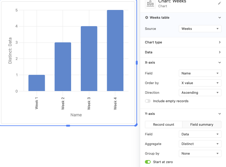
Hi Jake, here’s an example of what mine looks like, which I think is what you’re looking for:
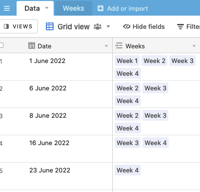
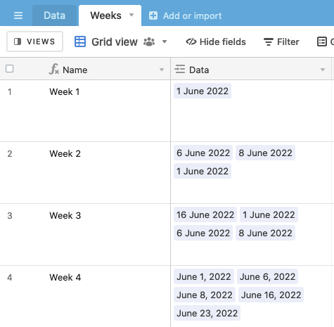
The idea is to have a linked field in the data table to a Weeks table, and to use an automation to link all the records to a new week record via a two step automation. This means that, if you were to add any historical data into the data table you’d have to manually add all of the week links though
I’ve set it up here for you to check out, and you should be able to view the automation
Let me know if you have any questions!
- Mark as New
- Bookmark
- Subscribe
- Subscribe to RSS Feed
- Permalink
- Report Inappropriate Content
Jun 13, 2022 04:09 PM
This is great, thanks Adam!


