- Mark as New
- Bookmark
- Subscribe
- Subscribe to RSS Feed
- Permalink
- Report Inappropriate Content
Nov 10, 2023 10:53 AM
Hello Airtable community,
I've been working on a project where users input data through a form, and the results are recorded in the base. I have set up a rollup field for each question to calculate the average of the results per field. Now, I want to create a graph in Interface Designer that displays all the columns along with their averages in a single graph and sorts them from highest to lowest average.
I'm currently having a hard time achieving this, and I'm wondering if I'm approaching it the wrong way. Could anyone provide guidance or suggest a more effective approach to visualize this data in the Interface Designer?
Thank you in advance for your assistance!
https://airtable.com/appbYmoC5vgmEZJPx/shrZ7wAcVoE0AcfIA
Solved! Go to Solution.
Accepted Solutions
- Mark as New
- Bookmark
- Subscribe
- Subscribe to RSS Feed
- Permalink
- Report Inappropriate Content
Nov 11, 2023 01:59 PM
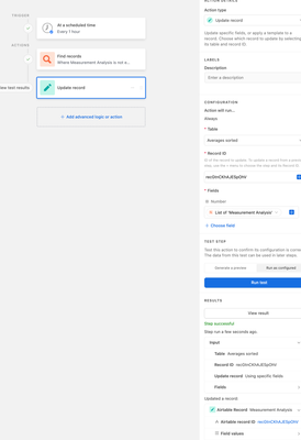
SOLVED: I use Automations to find the rollup records at a scheduled time (since # of automations is limited per plan per month) and update the record in the separate table used for the graph
- Mark as New
- Bookmark
- Subscribe
- Subscribe to RSS Feed
- Permalink
- Report Inappropriate Content
Nov 10, 2023 03:53 PM
Hey @Gerard_Blokdyk
Please see this video here https://www.loom.com/share/100e55efaf964492bfb9f0f429f57f25
Steven Da Silva
- Mark as New
- Bookmark
- Subscribe
- Subscribe to RSS Feed
- Permalink
- Report Inappropriate Content
Nov 10, 2023 07:04 PM
Thanks Steven, much appreciated!
Is there a way to have all columns in one graph so we can see which has the highest and lowest scores against each other right away. For example, something like this:
- Mark as New
- Bookmark
- Subscribe
- Subscribe to RSS Feed
- Permalink
- Report Inappropriate Content
Nov 11, 2023 01:59 PM
SOLVED: I use Automations to find the rollup records at a scheduled time (since # of automations is limited per plan per month) and update the record in the separate table used for the graph
- Mark as New
- Bookmark
- Subscribe
- Subscribe to RSS Feed
- Permalink
- Report Inappropriate Content
Nov 13, 2023 12:40 PM
@Gerard_Blokdyk Awesome nice work!


