Hello Airtable community,
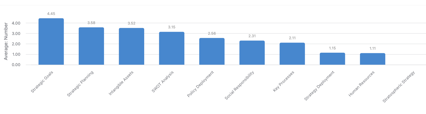
I've been working on a project where users input data through a form, and the results are recorded in the base. I have set up a rollup field for each question to calculate the average of the results per field. Now, I want to create a graph in Interface Designer that displays all the columns along with their averages in a single graph and sorts them from highest to lowest average.
I'm currently having a hard time achieving this, and I'm wondering if I'm approaching it the wrong way. Could anyone provide guidance or suggest a more effective approach to visualize this data in the Interface Designer?
Thank you in advance for your assistance!